Tips
How to Design an AI Automation Agency Website That Converts Clients in 2026
Most AI agency websites don’t convert. Here’s a simple structure to design an AI automation agency website that actually turns visitors into clients.
By

Widya Bayu W
Share

Summary
Most AI automation agency websites don’t convert because they’re unclear, not because the service is bad.
If you want your site to convert, follow this simple structure:
Hero: Clearly say who you help, what you do, and the result
Proof: Show logos, testimonials, or real numbers right away
Services: Explain what you do in simple, outcome-based language
Process: Show how it works in 3 to 5 clear steps
Case studies: Prove results with real examples
CTA: Tell people exactly what to do next and repeat it
Don’t try to sound smart. Just be clear.
If people understand what you do and trust you, they’ll book.
Why Most AI Automation Agency Websites Don’t Convert
Most AI automation agency websites look good on the surface. You see dark backgrounds, glowing gradients, smooth animations, and everything feels “AI”.
But once you actually land on the site, something feels off. You scroll a bit, read the headline, maybe skim a few sections, and then you leave. Not because the service is bad, but because the site never really explains anything clearly.
A lot of these websites say things like “We automate your business” or “Powering the future with AI”. It sounds impressive, but it doesn’t tell you who it’s for, what problem it solves, or what you actually get. And that’s where most agencies lose people. Visitors don’t spend time trying to figure things out.
If it’s not clear in a few seconds, they bounce.
After looking at a lot of AI agency websites, the ones that actually convert don’t try to be clever. They focus on being clear.
They follow a simple structure that guides the visitor from understanding to trust to action. Once you see it, you start noticing the same pattern everywhere.
What a High-Converting AI Agency Website Actually Looks Like
Before breaking everything down section by section, it helps to look at the full picture.
There’s a simple structure behind most high-converting landing pages, and this breakdown from Namya Khan, founder of Supafast, explains it really well.
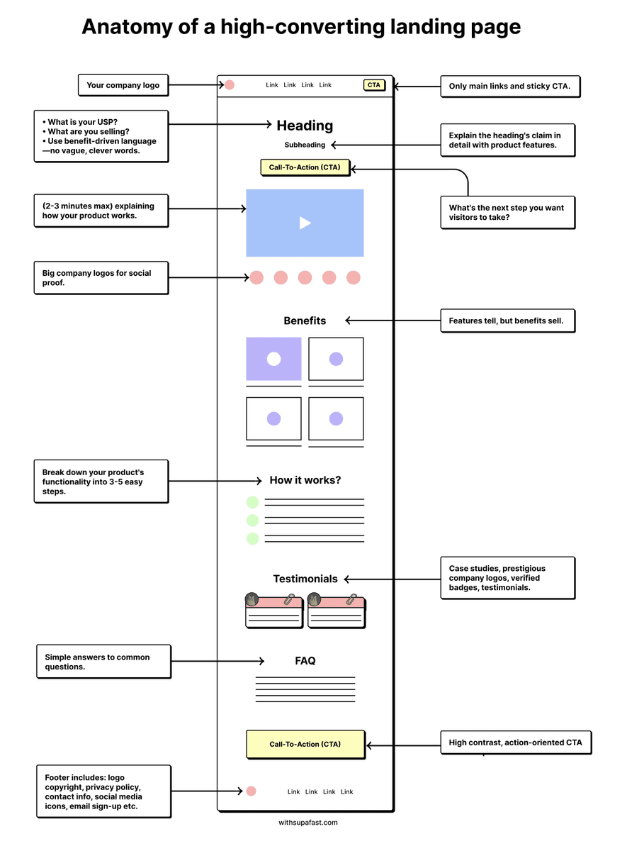
Source: Namya Khan
https://x.com/namyakhann/status/1811707543141425616
If you strip away all the design and visuals, the flow is actually very straightforward.
First, you explain what you do in a clear way. Then you show proof so people trust you. After that, you explain how it works so there’s no confusion. And finally, you guide them to take action.
Most AI agency websites don’t fail because they look bad. They fail because they skip one of these steps or try to overcomplicate it. Either the message is unclear, or there’s no proof, or the next step is confusing.
Once you fix the structure, everything else becomes much easier.
Your Hero Section Is Where Everything Starts
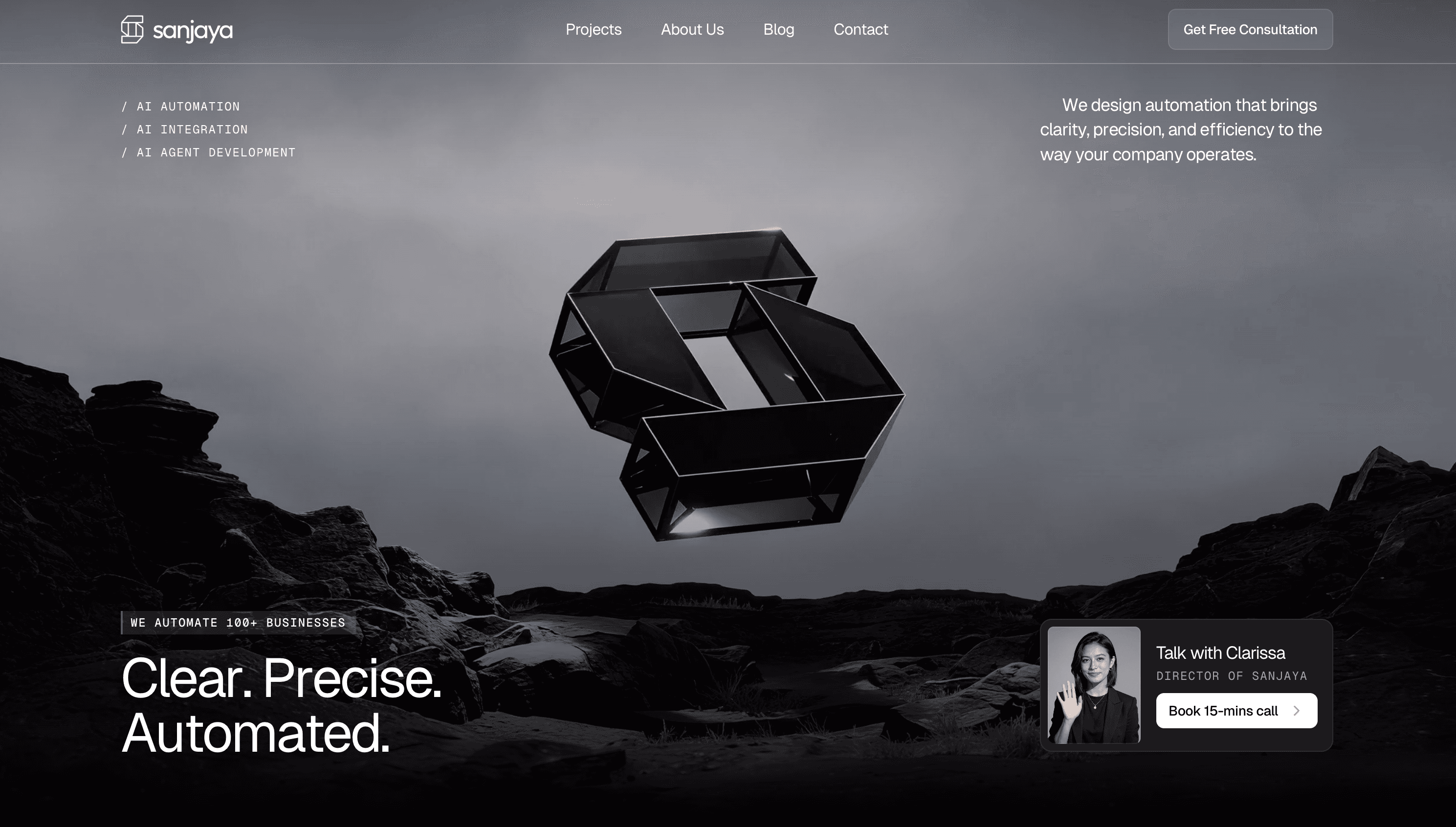
The hero section is the first thing people see, and it usually decides whether they stay or leave. This is where most agencies make the biggest mistake. They try to sound smart instead of being clear.
You’ll often see headlines like “Transforming businesses with AI automation” or “Reimagining workflows for the future”.
It sounds nice, but it doesn’t actually say anything. When someone lands on your site, they are not trying to be impressed.
They are trying to understand.
A strong hero section should answer 3 simple questions right away.
Who you help
What problem you solve
What result they get
For example, something like
“We help SaaS teams automate lead follow up and save 15+ hours a week”
works much better because it’s specific and outcome-driven.
The call to action matters just as much. You don’t need multiple buttons competing for attention. 1 clear CTA is enough.
Something like:
Book a call
Get a free audit
See case studies
The key is to make the next step obvious.
Avoid adding multiple buttons like “Learn more”, “Contact”, and “Explore”. It creates friction.
A simple structure that works:
Headline: Outcome
Subheadline: Who it’s for
CTA: What to do next
You can also support this with a simple visual. It doesn’t need to be complex. Even a screenshot of your automation flow or dashboard helps people quickly understand what you actually do.
Show Social Proof Right After the Hero
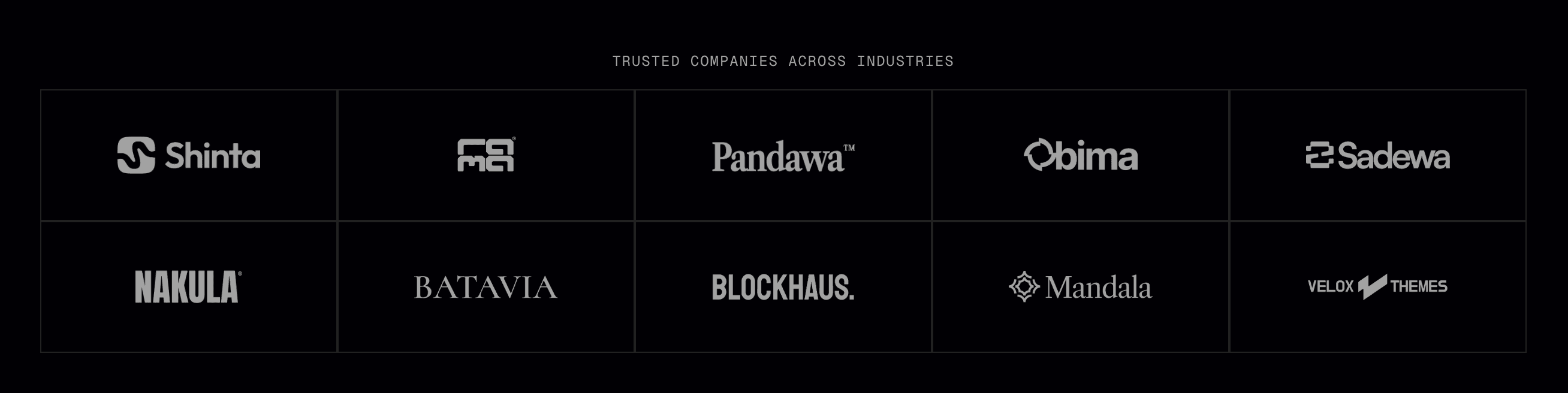
Once someone understands what you do, the next thing they think about is trust. This is why social proof should come right after your hero section, not buried somewhere at the bottom.
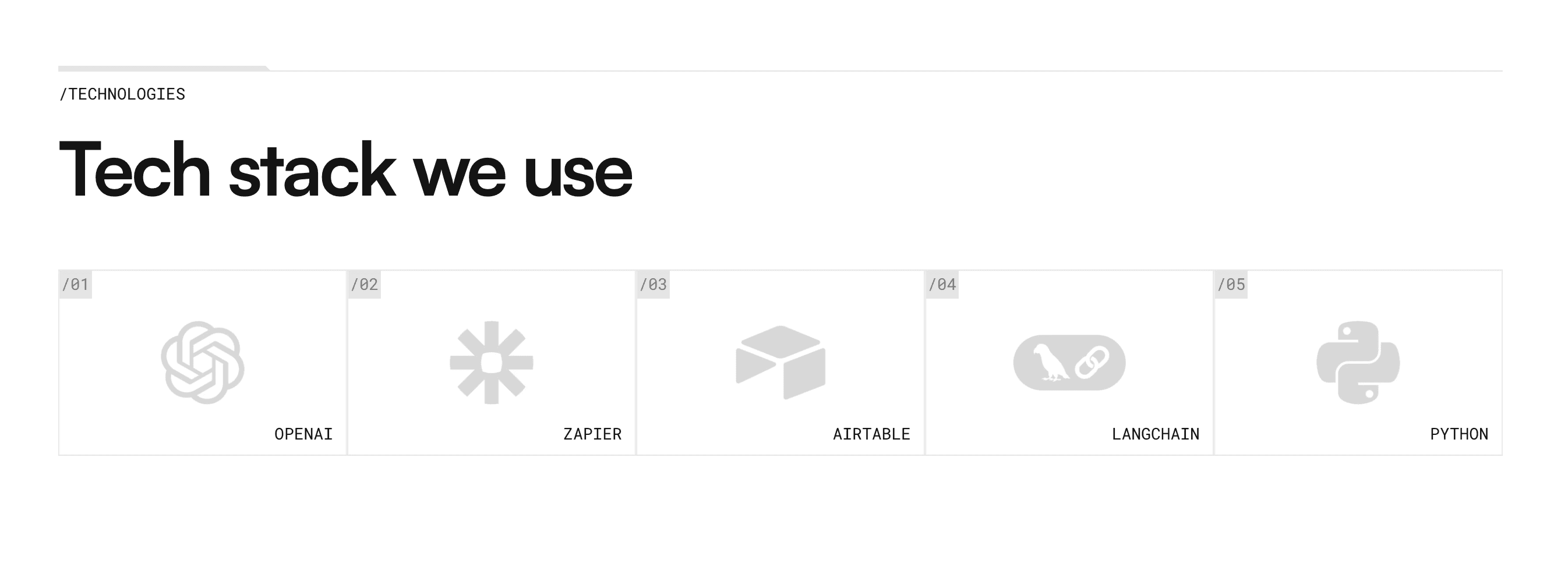
A simple way to do this is by showing logos. These could be clients you’ve worked with, or even tools you use, like:
Clients you worked with
Or tools like OpenAI, Zapier, Make, n8n
It signals that you are working with real systems and not just talking about ideas.
Testimonials also help, but they need to be specific.
Bad example:
“Great service, highly recommend”
Better example:
“We automated our onboarding and saved 40+ hours per month”
“Automated our onboarding and reduced manual work by 60%”
If you don’t have big clients yet, you can still build trust by showing numbers. Things like
Number of automations built
Hours saved
Industries you’ve worked with
Even small proof is better than none.
Your Services Section Should Be Easy to Understand
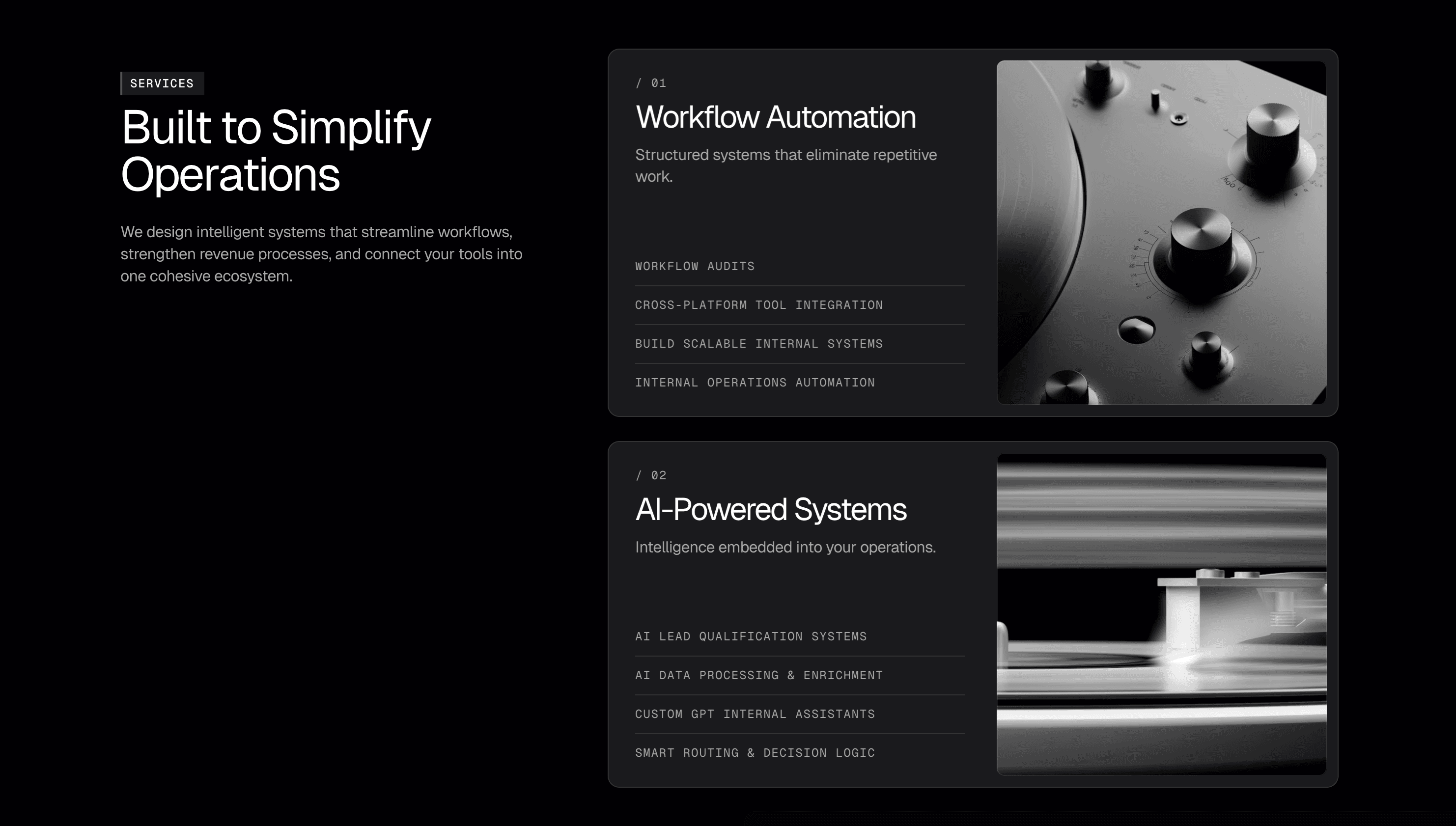
This is one of the most common weak points in AI agency websites. The services section often sounds technical, which makes sense from a builder’s perspective but not from a client’s perspective.
When you say something like “workflow orchestration” or “API integration”, it might be accurate, but most clients don’t understand it. What they care about is what it does for them.
A better way to write services is to focus on outcomes.
For example, instead of “CRM workflow integration”, you can say “automatically follow up with every lead so you never miss a deal”.
It’s the same thing, just easier to understand.
Each service should clearly explain what it does, who it’s for, and what result it creates.
For example:
Lead follow-up automation
Automatically follow up with every lead so you never miss a dealClient onboarding automation
Turn new clients into active users without manual workInternal workflow automation
Remove repetitive tasks and save your team hours every week
If possible, show the tools you use. Clients love seeing things like Zapier, Make, Airtable, or OpenAI because it makes your work feel real and tangible.
If you want to take it further, you can connect each service to a result or example. Even a short line like “used by SaaS teams to automate onboarding” adds more clarity.
A Simple Process Section Removes a Lot of Doubt
One thing many agencies overlook is that clients don’t know what it’s like to work with them. Even if the service sounds good, people hesitate because the process is unclear.
A simple process section solves this. You don’t need anything complicated. 3 to 5 steps are enough to show how things work.
For example:
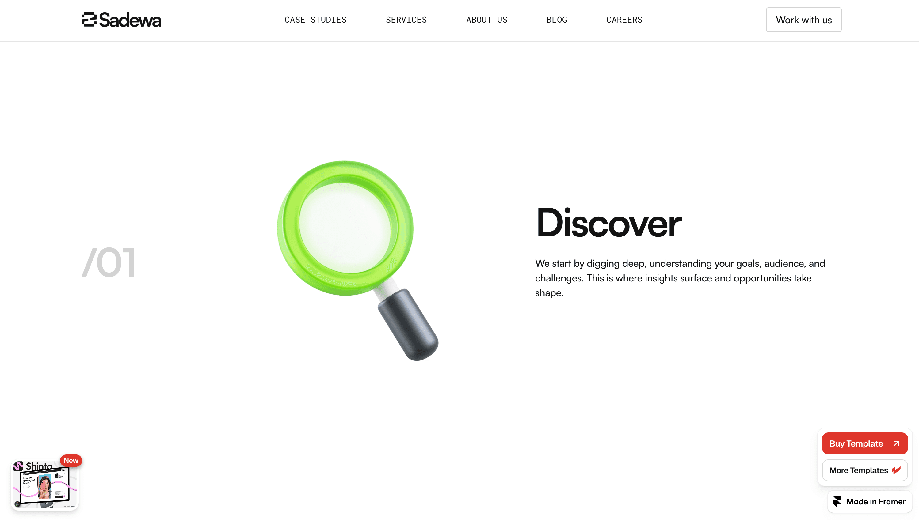
First, you start with a discovery call or audit.
Then you map out the automation.
Next, you build and test everything.
Finally, you hand it off and provide support.
What makes this section powerful is that it removes uncertainty. Instead of guessing what happens next, the client can clearly see the journey. You can even add a small example to make it more real, like explaining how you helped a client automate onboarding or lead follow up.
Case Studies Make Everything More Real
Testimonials are helpful, but case studies are what really convince people. A testimonial tells someone you are good. A case study shows exactly how you deliver results.
You don’t need long, detailed stories.
A simple structure works best:
Who the client is
What problem they had
What you built
What result they got
Here is an example:
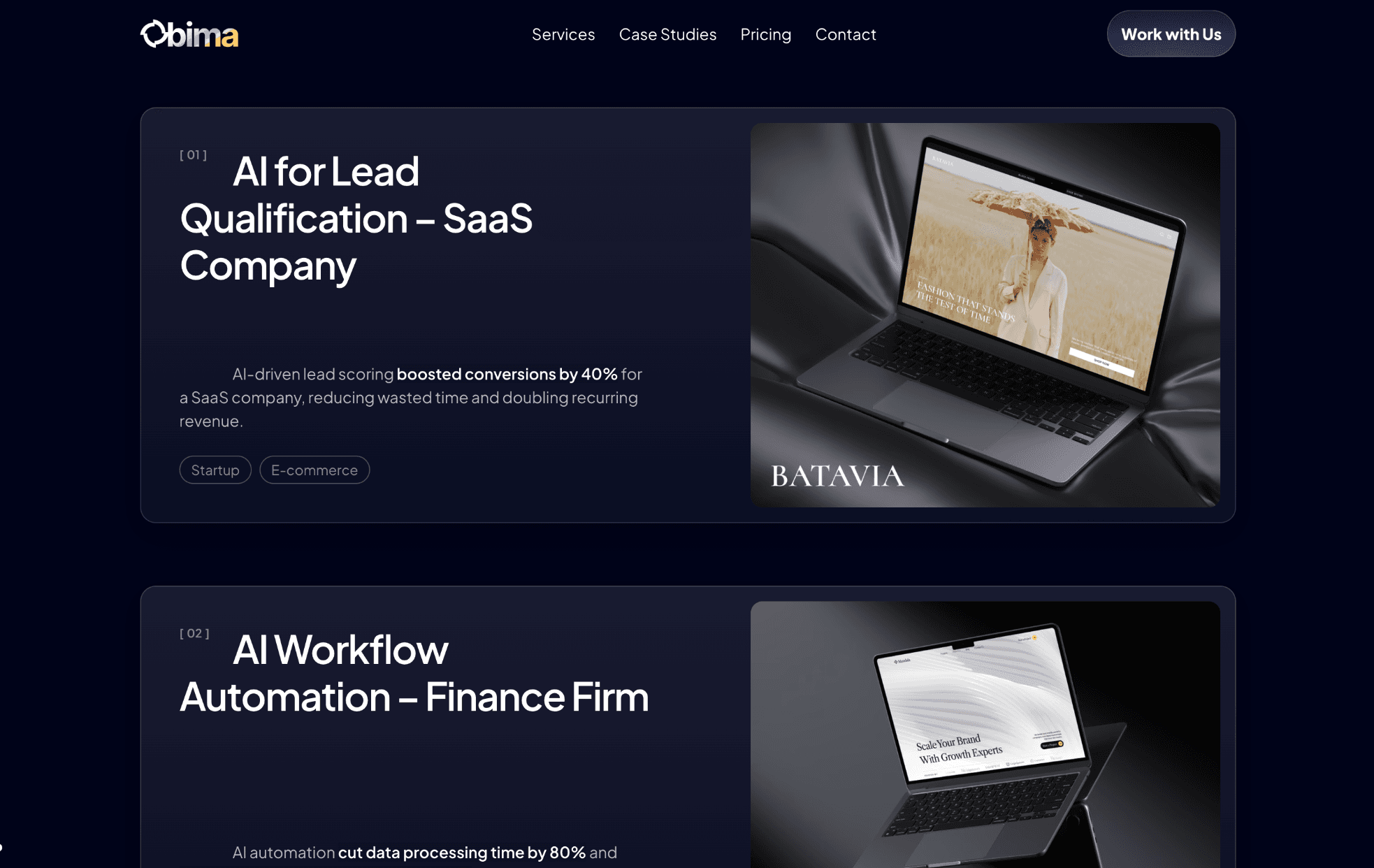
Client: B2B SaaS startup
Problem: Leads were not being followed up fast enough
Solution: Built an automated follow-up system using HubSpot + OpenAI
Result: Increased response rate by 35% and saved 20+ hours per week
You don’t need a long story. 3 to 4 sentences is enough.
That kind of clarity makes your work feel real. Even 1 or 2 case studies like this can significantly improve your conversion rate. If you don’t have full case studies yet, you can turn strong testimonials into short result-focused stories.
Your Call to Action Needs to Be Clear
A lot of agency websites end with something like “Contact us” or “Get in touch”. It feels safe, but it’s not effective.
Your call to action should clearly tell people what they are getting and what happens next.
For example, instead of “Contact us”, you could say:
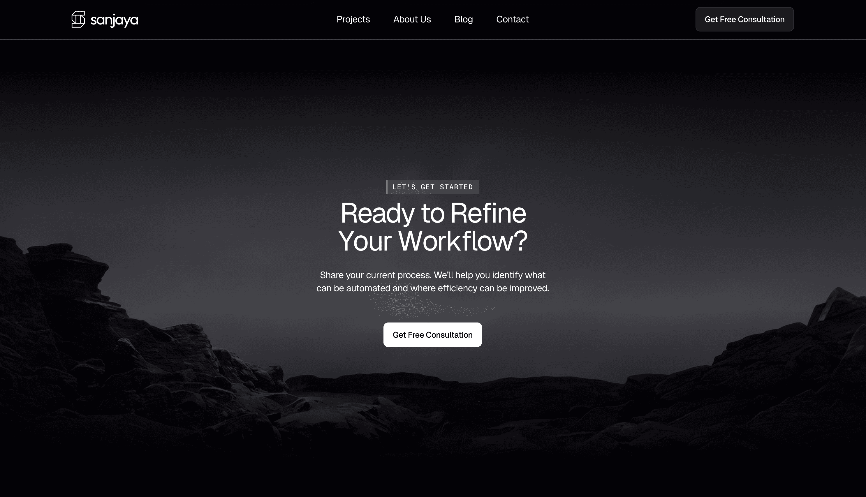
Book a free 30-minute automation audit
See if your business is a good fit
Get your first automation built
This small change makes a big difference because it removes uncertainty.
People know exactly what they are signing up for.
It also helps to repeat your CTA throughout the page. Not everyone is ready to act the first time they see it. Some people need to scroll, read, and build trust before taking action.
Having the CTA in the hero, middle, and bottom makes it easier for them to convert when they’re ready.
Which Framer Template Works Best for an AI Automation Agency
Once you understand the structure, the next question is how to actually build it. Designing everything from scratch can take a lot of time, especially if you’re also working on the service itself.
A simpler approach is to start with a template that already follows this structure. You just need to plug in your offer, copy, and proof.
If you want a head start, check out these AI automation agency Framer templates.
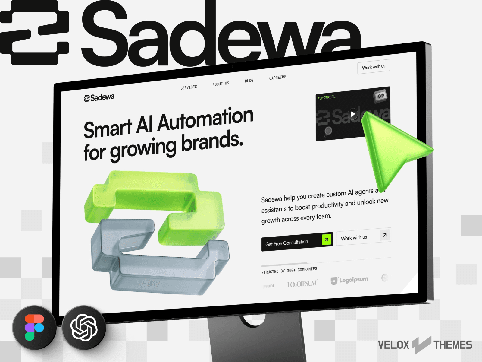
Templates like Bima, Sadewa, and Sanjaya are already designed around this exact layout, so you can focus on your content instead of figuring out the structure.
This can save you a lot of time, especially if you just want to launch quickly.
FAQ: AI Automation Agency Website
What is the best layout for an AI automation agency website?
The best layout follows a simple flow where you explain what you do, show proof, describe your services, explain your process, and then guide users to take action.
Why is my AI agency website not converting?
Most of the time it’s because the message is unclear or there is not enough proof. People don’t understand what you do or don’t trust it yet.
Do I need case studies to get clients?
Yes, even 1 or 2 strong case studies can make a big difference. If you don’t have them yet, start with results-based testimonials.
Should I use Framer to build my agency website?
Framer is a strong choice if you want flexibility, speed, and modern design. It works especially well for agency websites.
Final Thoughts
A high-converting AI automation agency website is not about looking the most advanced or futuristic. It is about being clear, building trust quickly, and guiding people toward taking action.
If your site clearly explains what you do, shows real proof, makes your services easy to understand, and removes doubt with a simple process, you are already ahead of most agencies.
Once the structure is right, everything else becomes easier.
If you’re still deciding which platform to use, you can check out this breakdown of Framer vs Webflow to see which one fits your workflow better.
Meet the author
Widya Bayu W
Widya Bayu W is a Framer expert and Co-founder of Velox Themes, he has 7+ years experience in design industry and now helping designers and agencies build website faster.
Ship Fast With Quality Framer Templates
No code required
Fast support
Ship faster


