Tips15 min read
How to Vibe Code a Website That Doesn't Look Like AI Slop
How to vibe code a landing page that looks designed, not like AI slop. 10 steps from brief to launch, with real prompts and a free checklist.
Vibe coding went from a joke to a job in under two years. Andrej Karpathy named it in February 2025: you describe what you want, the AI writes the code, and you "give in to the vibes". By November, Collins Dictionary had made "vibe coding" its Word of the Year.
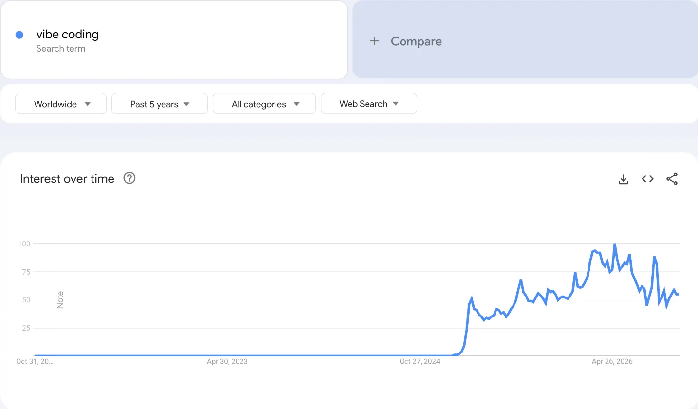
The search data tells the same story. Interest in "vibe coding" was zero before February 2025, then jumped, and it is still about half of its spring 2026 peak today.
The models keep getting better, too. METR found that the length of tasks AI agents can finish has doubled about every 7 months since 2019. And in Y Combinator's Winter 2025 batch, a quarter of the startups had codebases that were about 95% written by AI.
So building a website with AI is easy now. The hard part is making it look good. Most vibe-coded websites look the same: the same fonts, the same glowing cards, the same little badges. People call it AI slop, and visitors spot it in a second.
In this guide, I show you how to vibe code a website or landing page that looks designed. Every step comes with the prompt or the reference I used when I tested it.
The short version: write a real brief, get a reference before you prompt, plan your sections, build one section at a time, then make the agent test its own work before you launch. The biggest single fix is the reference.
What AI slop looks like on a website (and why it happens)
When you ask an AI to "build a landing page" with no other direction, it picks the most common choices it has seen. In my test of 7 Claude Code design skills, and again in this test, the same things kept showing up:
- A highlighter mark or a thin italic serif word inside a bold headline.
- Small dash labels above every heading, like "— BENEFITS", or a "NEW" badge nobody asked for.
- One bright accent color (orange, lime or purple) on every button.
- Four cards with an icon each, in a row.
- Dark cards with a soft glow, usually around the pricing or the final call to action.
- Fake browser windows around screenshots.
None of these is wrong on its own, and good designs use some of them too. The problem is that every AI site uses all of them, by default. The AI is not being lazy. It is guessing, because nobody told it what this brand should look like. Your job is to stop it from guessing.
3 ways to vibe code a website, and which one to pick
There are three main ways to build a website with AI in 2026:
| Route | Examples | Good for | Watch out for |
|---|---|---|---|
| AI site builders | Framer AI, Wix, Squarespace | A site you edit visually, with hosting included | The site lives on their platform. Moving it later is hard. |
| AI app builders | Lovable, Bolt, v0, Base44 | A quick first version from a chat in your browser | Check how you can take the code with you, and what it costs to keep editing. |
| Coding agents | Claude Code, Codex, Cursor | Full control, code you own, any hosting | You run it on your computer and need to be comfortable with a terminal. |
If you want to drag things around in a visual editor, an AI site builder is fine. If you build sites for clients and want code you own, use a coding agent. I use Claude Code, but every step below works with Codex or Cursor too.
Step 1: Write the brief before the first prompt
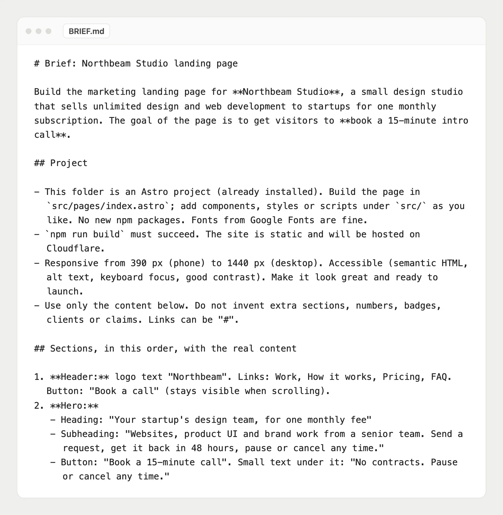
A one-line prompt gets a generic page, because the AI fills every gap with defaults. A short brief fills those gaps for it. Write it in a file in your project, like BRIEF.md, so the agent can read it again later.
A good brief answers five things:
- Who is it for? The business and the people who visit.
- What is the one action? Book a call, start a trial, buy. One page, one goal.
- What is the real copy? The headline, subheading, buttons, benefits, prices and FAQ. Write it yourself, or at least approve it.
- Which sections, in which order? Step 3 helps with this.
- What must it not do? For example: no made-up numbers, badges, clients or reviews.
You don't have to write it alone. Paste this prompt into your agent and fill in the parts in brackets. It will ask you for the copy and save the brief for you:
Help me write BRIEF.md for my landing page and save it in this project. The business: [what you sell, and to whom]. The one goal of the page: [for example, book a 15-minute call]. Ask me questions until you have the real copy for every section: headline, subheading, buttons, benefits, how it works, testimonials, pricing and FAQ. List the sections in order. End the brief with this rule: use only the content in this file, and don't invent numbers, badges, clients or reviews.The rule at the end matters more than it looks.
Step 2: Get a reference before you prompt
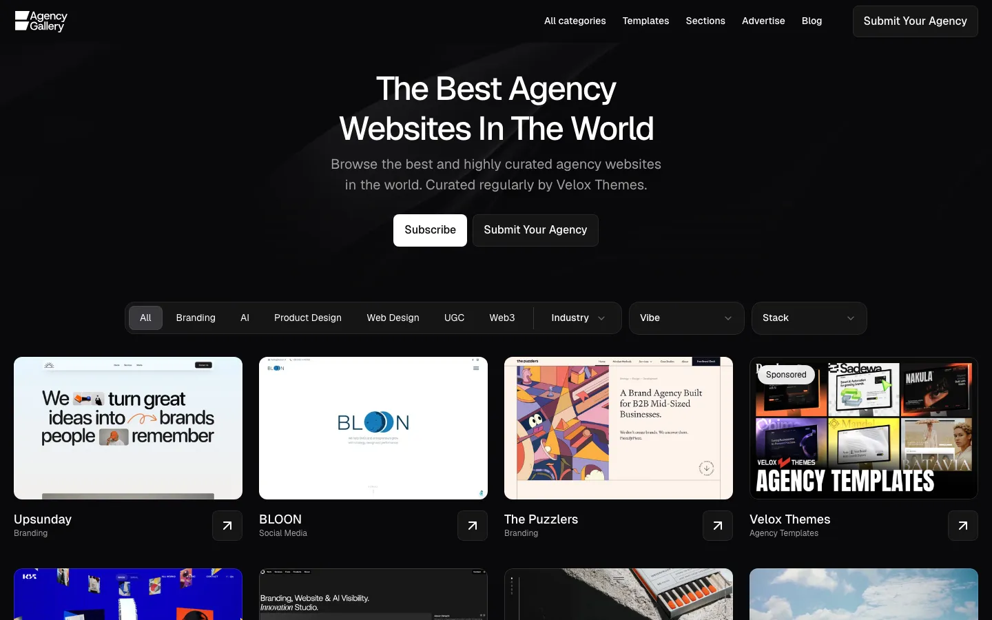
This is the step that fixes AI slop. A reference shows the AI what "good" means for this site, so it follows a design instead of guessing one.
Where to find references:
- Pinterest: fast for moodboards, colors and type.
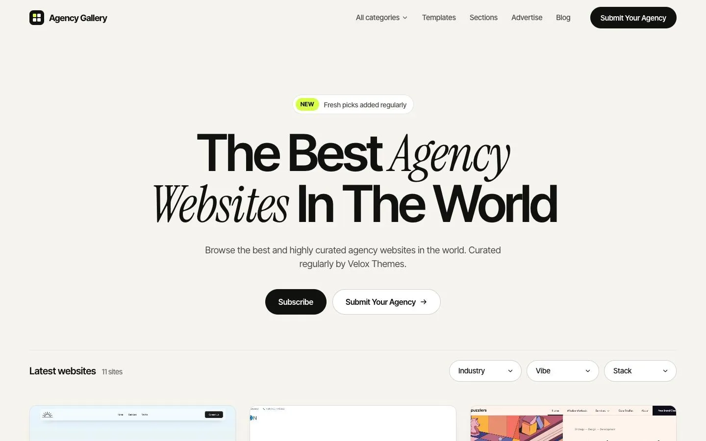
- Agency Gallery: our free gallery of real agency websites, with screenshots of each section (hero, about, services, pricing, FAQ).
- Mobbin: a searchable library of screens and flows from real websites and apps. On its Pro and Team plans, your AI agent can search it too, through MCP.
- Other inspiration sites and the best sites in your client's industry.
Keep the screenshots you pick. You will attach them to your prompts later, one per section.
Even better: design the page first in Figma or Paper. Then the agent builds your design, it does not invent one. Paper is a design tool built on HTML and CSS, and AI agents like Claude Code can read and edit its canvas through MCP, so the design and the code stay close. If you can only design one thing, design the hero. It sets the look for every section below it.
I tested this in my Claude Code skills post. No design skill avoided AI slop on its own. Every run that had a reference did, with or without a skill.
Step 3: Plan your landing page sections
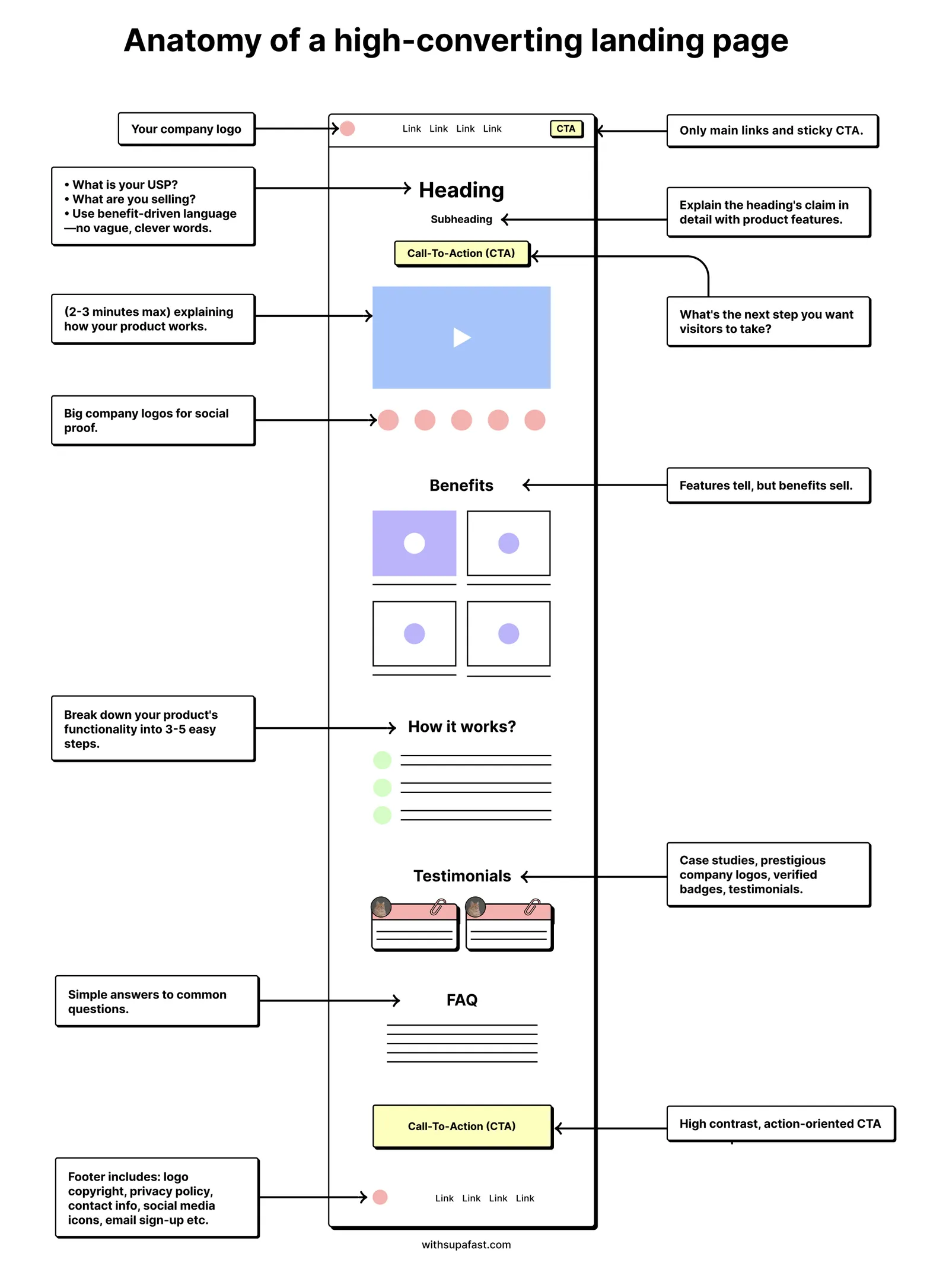
Most landing pages that convert follow the same order. Namya Khan's anatomy of a high-converting landing page is the clearest version I know, and I used it for my test:
- Header: your main links and a call-to-action button that stays visible.
- Hero: a heading that says what you do, a subheading, one button and a short demo or real work.
- Logos: clients or press, so people trust you early.
- Benefits: why someone should pick you, in plain words.
- How it works: 3 to 5 simple steps.
- Testimonials: real quotes with real names.
- Pricing, if you show it.
- FAQ: answer the questions that stop people from buying.
- Final call to action: high contrast, one button.
- Footer.
The flow is simple: say what you do, prove it, explain how it works, then ask for the action. Put this list in your brief, in this order, with the real copy for each section.
Step 4: Pick your stack: Astro on Cloudflare
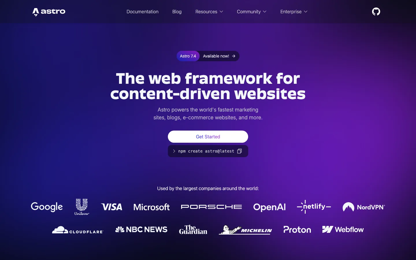
For a marketing site or landing page, I recommend Astro, hosted on Cloudflare. It is what veloxthemes.com runs on.
Why Astro: it is fast because it ships very little JavaScript. Astro turns your components into plain HTML and sends no JavaScript for them unless you ask for it. Next.js is great for apps, but it sends a JavaScript framework to the browser with every page. A landing page rarely needs that. In my test, the brief-only Astro build had no JavaScript files at all, just 595 bytes of inline script for the mobile menu.
Why Cloudflare: the free plan is generous. Static files like your HTML, CSS and images are free and unlimited, and you get 100,000 requests a day for server code. If you ever need more, the paid plan starts at $5 a month.
Here is the full stack I recommend for a marketing site or landing page:
- Astro for fast and lightweight websites
- Motion for beautiful animations (or GSAP for complex scroll timelines)
- Lenis for smooth scrolling
- Tailwind CSS for styling
- Cloudflare for fast and reliable hosting
- Velox Themes for website designs and UI components
- PostHog for analytics and conversion tracking
- Google Search Console for SEO performance
When should you pick something else? If you are building an app with logins, dashboards and lots of live data, Next.js is a better fit. We use it for the Velox Themes library for exactly that reason.
To start, run npm create astro@latest and pick the minimal template. Then open Claude Code in that folder.
Step 5: Start from real designed sections, not a blank prompt
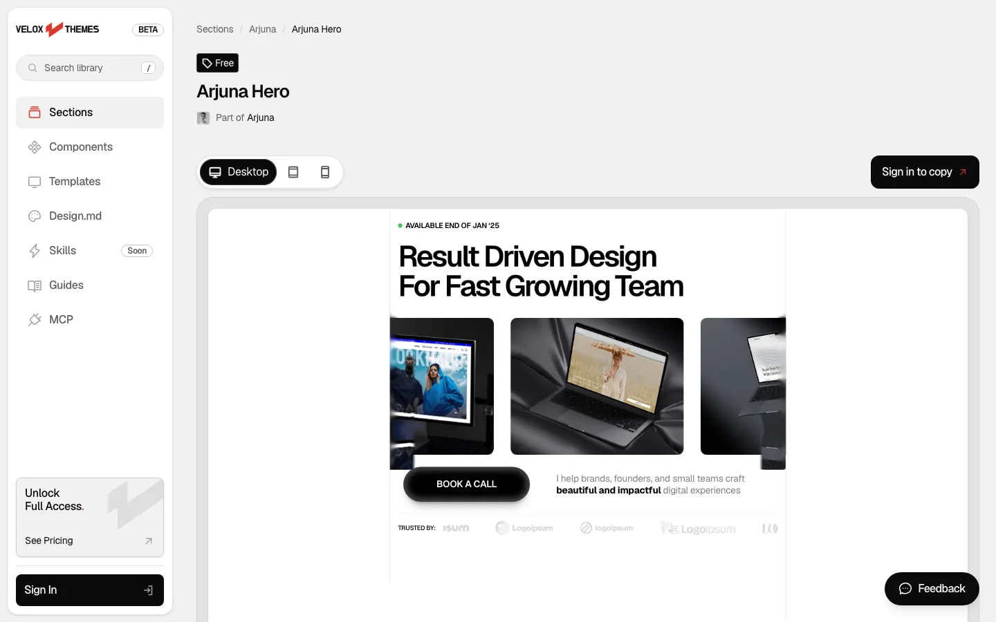
A reference picture helps. A real section helps more, because the AI gets the actual layout, spacing, type sizes and motion, not just a guess from a screenshot.
You can start from:
- Your own Figma or Paper design (step 2).
- A template you already own.
- Sections from a library. With Velox Themes, you can copy free sections with a free account (3 copies a day). Each one has a Copy prompt you paste into Claude Code, Codex or Cursor, with the full code inside.
On a paid plan, the Velox MCP lets your agent pull sections from the library itself, matched to your stack, like Astro.
Pick sections from one design family, so the page has one style. Mixing a hero from one site with pricing from another is how you get a page that feels off without knowing why. If the family is missing a section you need, restyle one from elsewhere to match it.
Step 6: Build one section at a time with small prompts
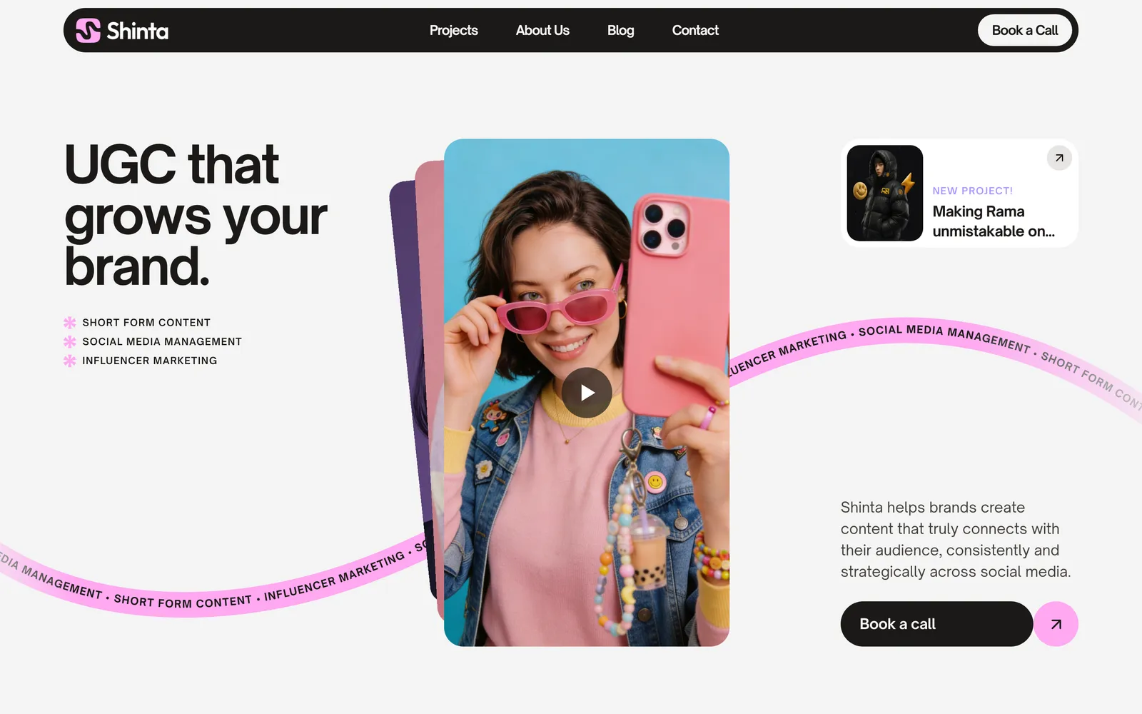
Do not ask for the whole page in one go. Build it section by section, check each one, then move on. Small prompts give you small, easy fixes.
Here is the prompt I use for each section. Attach the reference screenshot for that section, and change the part in brackets:
Read BRIEF.md. Build the [hero] section. Copy the layout, fonts, colors and spacing from the reference screenshot I attached. Use the copy from BRIEF.md word for word, and don't add anything that isn't in it. When you're done, open the page and check this section at 390 px and 1440 px wide.A few habits that help:
- Set the rules once. Write your font, colors and button style into the brief (or a
DESIGN.mdfile), so every section follows them. - Save after each section. Commit to Git when a section looks right. If the next prompt breaks something, you can go back.
- Describe problems plainly. "The heading overlaps the image at 1440 px" works better than "make it look better".
Step 7: Add motion that feels designed
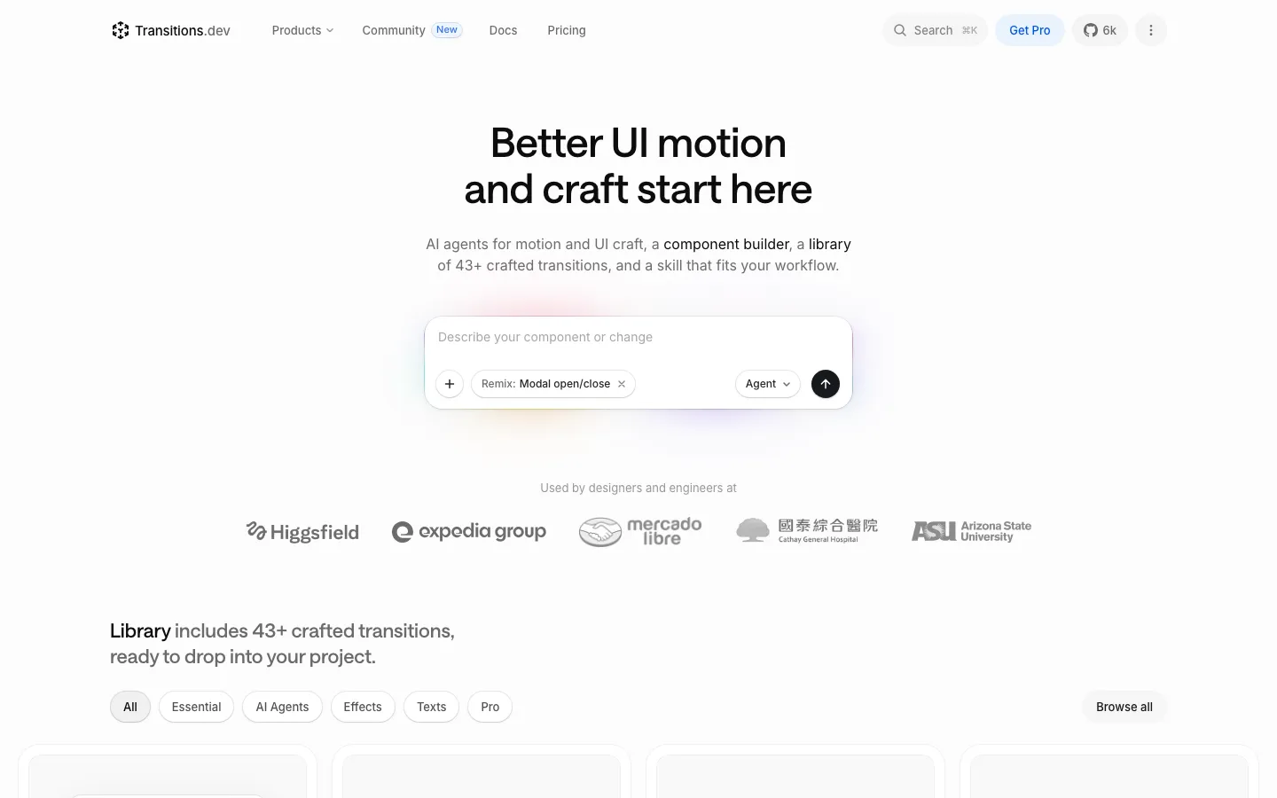
Good motion makes a page feel finished. Too much motion makes it feel like a template demo. Use it for a few moments: the hero entrance, hover states, a menu opening.
If you want help nailing it, Jakub Antalik's transitions.dev is a library of 43+ crafted transitions that comes with a skill for your agent:
npx skills add Jakubantalik/transitions.devMany transitions are free with no account. The Pro ones need a sign-in. In my skills test, it added small animations that worked, in about 4.5 minutes.
Whatever you add, check that the page still works when someone turns on "reduce motion" in their system settings. Ask the agent to respect prefers-reduced-motion.
Step 8: Make the agent test its own work
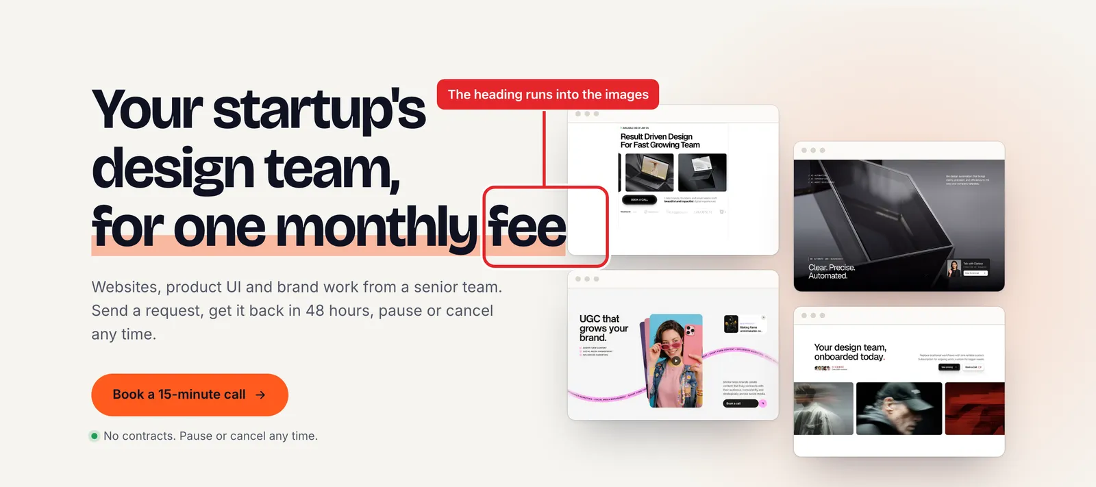
This is the step most people skip. The AI writes code that builds without errors, says "done", and never looks at the page.
That is exactly what happened in my first test build. The agent said it could not open a browser, never looked at its page, and shipped a hero where the last line of the heading ran into the images at desktop size. A human would see that in one second. In a second run, with Velox sections as the reference, the agent had the same tools, but it wrote a small script to open the page in a headless browser and checked it at three screen sizes. It found no errors, and I found no layout bugs in it either.
So give your agent a way to see the page, like a browser tool, and ask it to check:
- A screenshot at phone size (390 px wide) and desktop size (1440 px wide).
- No text overlapping, cut off or running off the screen.
- No errors in the browser console.
- Every image has alt text, and every button has a label.
- Every link and button does what it should.
This prompt covers all of it:
Open the page in a browser and check it at 390 px and 1440 px wide. Take a screenshot at each size and look for text that overlaps, gets cut off or runs off the screen. Check the console for errors, check that every image has alt text and every button has a label, and click every link and button. Fix what you find, then check again until everything passes.In my skills post, the pstack skill found and fixed 4 real bugs this way.
Step 9: Check speed, SEO, accessibility and security before launch
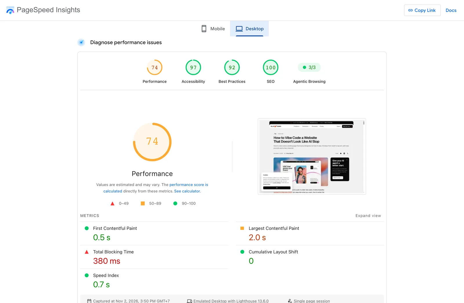
Before you share the link, run through these:
- Speed: run the page through PageSpeed Insights. Compress your images (WebP is a good default) and set their width and height so the page does not jump while it loads.
- SEO: one H1, a unique title and meta description, real text in headings (not text inside images), and a sitemap.
- Accessibility: enough contrast between text and background, a visible focus ring when you use the keyboard, and labels on every form field.
- Security: no API keys or passwords in your front-end code, spam protection on forms, and only the scripts you actually need.
Your agent can do most of this list for you:
Before launch, check the page: images compressed to WebP with width and height set, one H1, a unique title and meta description, a sitemap, enough color contrast, a visible keyboard focus, labels on every form field, and no API keys or passwords in the front-end code. Show me what you found, then fix it.For a deeper security check, Cloudflare's free security audit skill turns your agent into a security auditor. It maps your project, hunts for problems and double-checks every finding before it reports it. Install it:
npx skills add https://github.com/cloudflare/security-audit-skill --skill security-auditThen ask your agent to "security audit this codebase".
Step 10: Deploy it and own your code
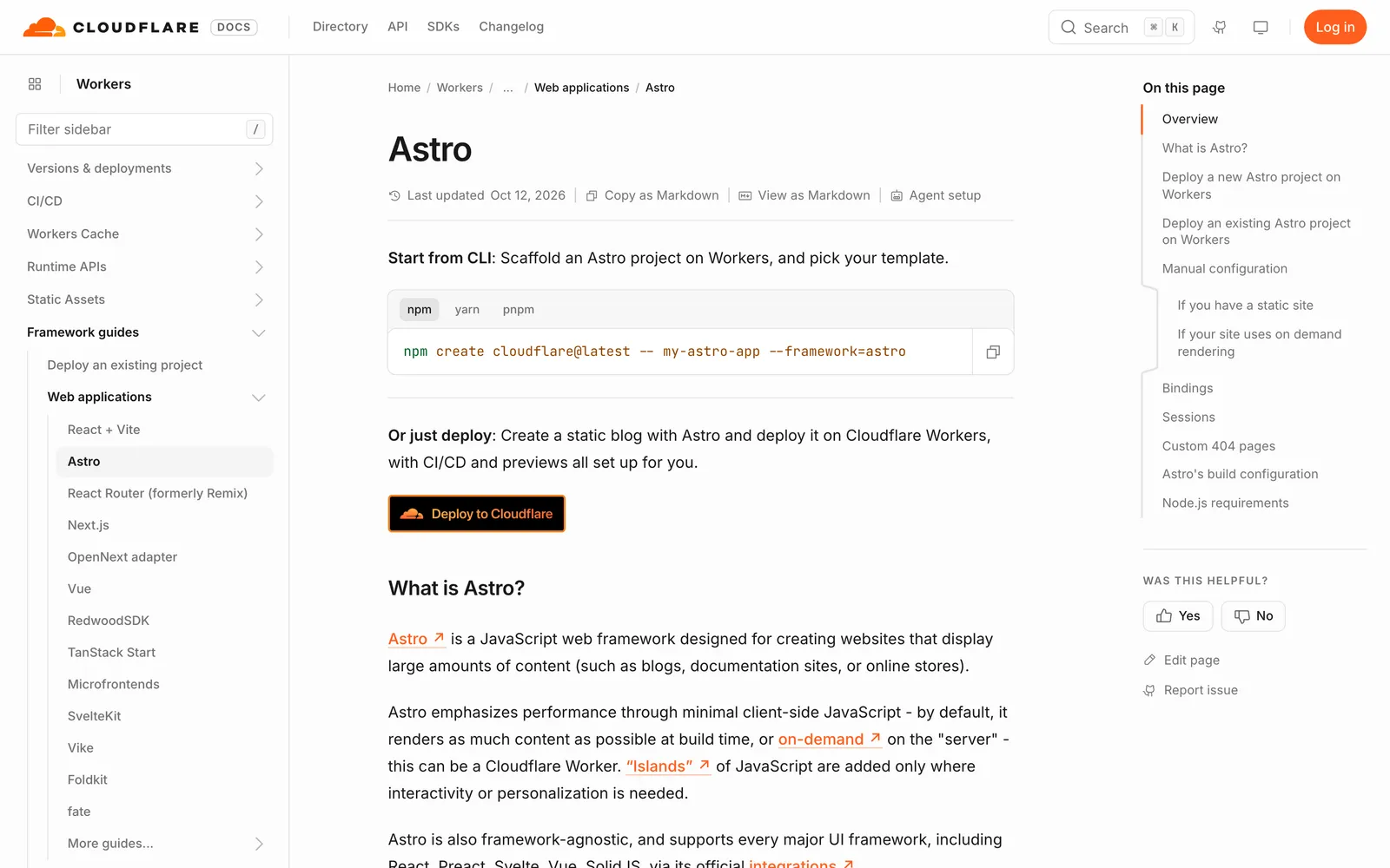
Push your project to GitHub. In the Cloudflare dashboard, create a new application and import your repository. For a static Astro site, the build command is npm run build and the output folder is dist.
Your agent can do the GitHub part and guide you through the rest:
Push this project to a new private GitHub repository. Then walk me through connecting it to Cloudflare, with npm run build as the build command and dist as the output folder.From then on, every push to GitHub updates the live site. The code is yours: you can move it to another host, hand it to a client, or keep editing it with any AI tool you like.
The AI slop checklist
Before you launch, go through this list. Every "yes" is something to fix.
- Is there a highlighter, gradient text or an italic serif word in the headline that the brand did not ask for?
- Are there dash labels like "— FEATURES" above every heading that no design asked for?
- Is there a badge, number, rating or client logo you cannot back up?
- Are there four identical icon cards in a row?
- Are there dark cards with a glow?
- Are screenshots wrapped in fake browser windows?
- Are there more than two fonts, or an accent color on everything?
- Does the page look like the last three AI sites you saw?
- Did nobody (human or agent) look at it on a phone?
FAQ
Can I vibe code a website with no coding experience?
Yes. AI site builders and app builders need no code at all. A coding agent like Claude Code asks you to use a terminal and approve changes, but you do not need to write the code yourself. It helps to learn the basics of how a website is structured, so you can describe problems clearly.
What is the best AI tool to vibe code a website?
For a site you edit visually, an AI site builder like Framer is the easiest. For code you own, a coding agent like Claude Code, Codex or Cursor. The tool matters less than the brief and the reference you give it.
How much does it cost to vibe code a website?
In my test, one landing page cost $1.05 in AI usage with the brief alone and $6.87 in a second run with a full design reference. Add your AI plan, a domain, and any paid sections or templates. Hosting a static site on Cloudflare can be free.
Are vibe-coded websites good for SEO?
They can be. Search engines care about the result, not who wrote the code. Use a fast stack like Astro, real text in your headings, a title and meta description on every page, alt text on images and a sitemap. Then check it with PageSpeed Insights.
Do I own the code?
With a coding agent, yes: the code is in your project folder and your GitHub. With site builders and app builders, it depends on the platform, so check how you can export your site before you build on it.
How do I stop my site from looking like AI slop?
Give the AI a reference before you prompt: your own design, a template, or real designed sections. Then set clear rules (one font, one accent color, no invented badges) and check the result against the AI slop checklist above.
If you want designed sections to start from, browse the Velox Themes library and copy the free ones with a free account. My full step-by-step workflow, with the exact prompts and files, is coming soon as a guide for members.