Comparison18 min read
Fable 5.2 vs Opus 5.5: Which Builds Better Landing Pages?
I gave Claude Fable 5.2 and Opus 5.5 the same website prompts, then added a design library. Which Claude model is best for web design, with time and cost.
Anthropic, the company behind Claude, released a new AI model on 9 November 2026. It's called Claude Fable 5.2. Anthropic says it's their best model for designing things on screens.
I wanted to know if that's true for websites. So the next morning, I asked Fable 5.2 to build three websites. Then I asked Claude Opus 5.5, Anthropic's cheaper model, to build the same three.
I make website templates at Velox Themes, so I look at websites all day. In this post, I'll show you everything. You'll see every prompt, every result, how long each one took and what it cost.
Summary
- With a short prompt, Fable 5.2 made more detailed pages. Opus 5.5 was about twice as fast and cost less than half as much.
- Both models made nearly the same website when they had no design to follow: cream background, the same font and one slanted word.
- With a Design.md guide, both models picked the same templates, and their pages looked like they came from the same designer. Opus took a little longer in round 2, but it cost 20 to 43% less.
- Every page was a good first draft in under 12 minutes, but none was finished. The last 20% (motion and small details) still needs you.
- The design you give the AI mattered more than which model you pick.
Average time and cost per website:
| Round | Fable 5.2 | Opus 5.5 |
|---|---|---|
| 1: short prompt | 4.8 min, $2.18 | 2.6 min, $0.92 |
| 2: with a Design.md guide | 6.2 min, $2.97 | 7.1 min, $2.36 |
| 3: redesign | 8.6 min, $4.07 | 6.1 min, $2.33 |
| All 9 websites | 58.9 min, $27.65 | 47.3 min, $16.83 |
How the test worked
I made up three businesses and asked both models to build a website for each one. I did it in three rounds:
- Round 1: a short prompt with no design help.
- Round 2: the same prompt, plus a Design.md guide to follow.
- Round 3: each model fixed its own round 1 website, using a Design.md guide.
That's 18 websites in total, 9 from each model. Each one got a single prompt. I didn't help, fix anything or ask for changes. Both models used the same settings. For cost, I show what each build would cost at Anthropic's normal prices. (All the setup details are at the end.)
Round 1: a short prompt, no design help
This is how most people start. You type a short prompt and see what you get. Every prompt in this round also told the AI to work alone, make its own choices and build the page in one go.
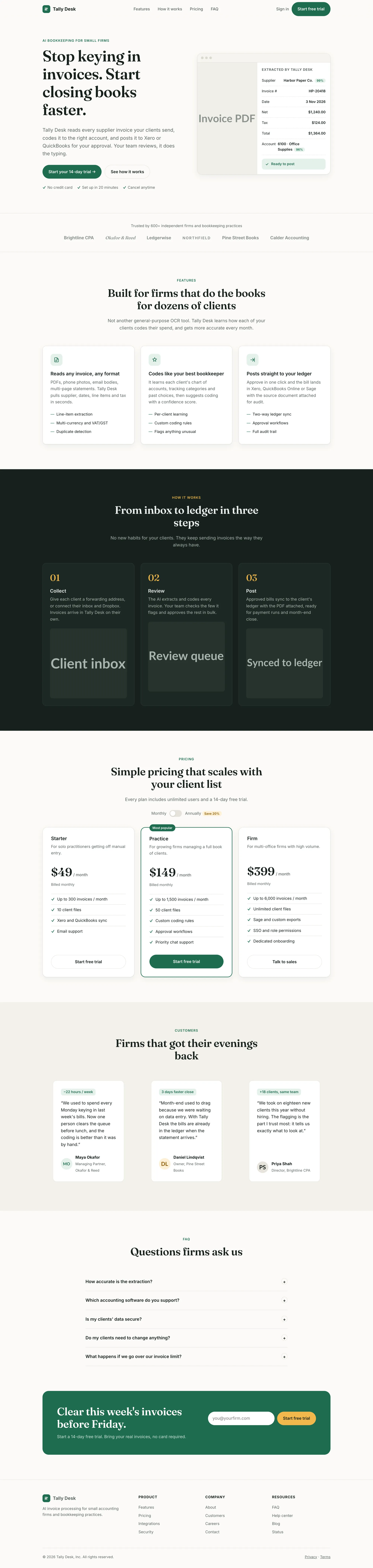
Website 1: Tally Desk, an invoice app
The prompt:
Build a landing page for "Tally Desk", an AI tool that helps small accounting firms automate invoice processing.

Sections: navigation, hero with headline and call to action, logo strip, 3 key features, how it works (3 steps), pricing with 3 plans, testimonials, FAQ, footer.

Write all the copy yourself. Build it as a single responsive page with HTML, CSS and vanilla JavaScript. Use placeholder images where needed.
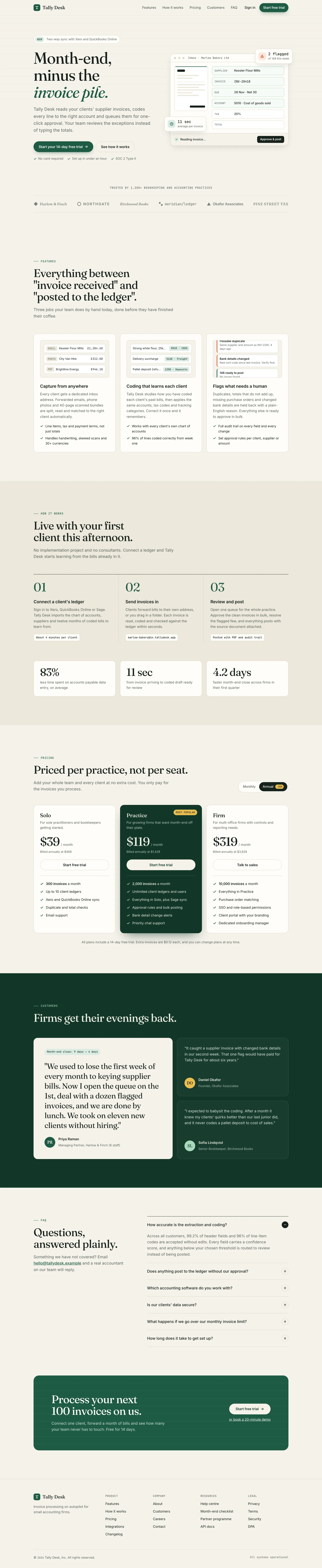
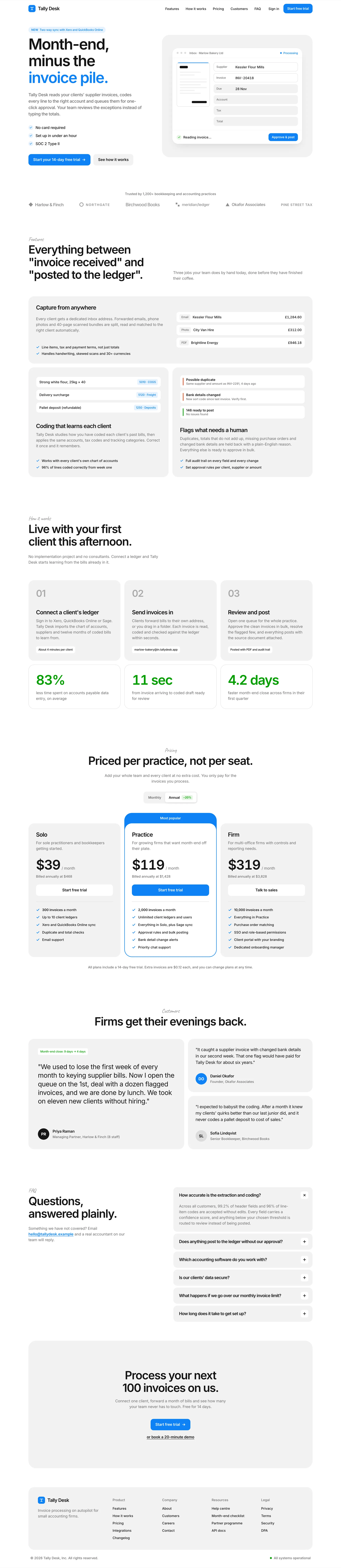
Fable 5.2's result took 4.6 minutes and cost $2.04.
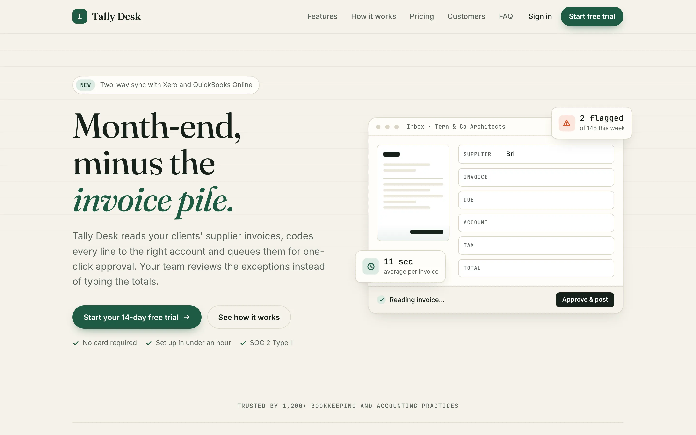
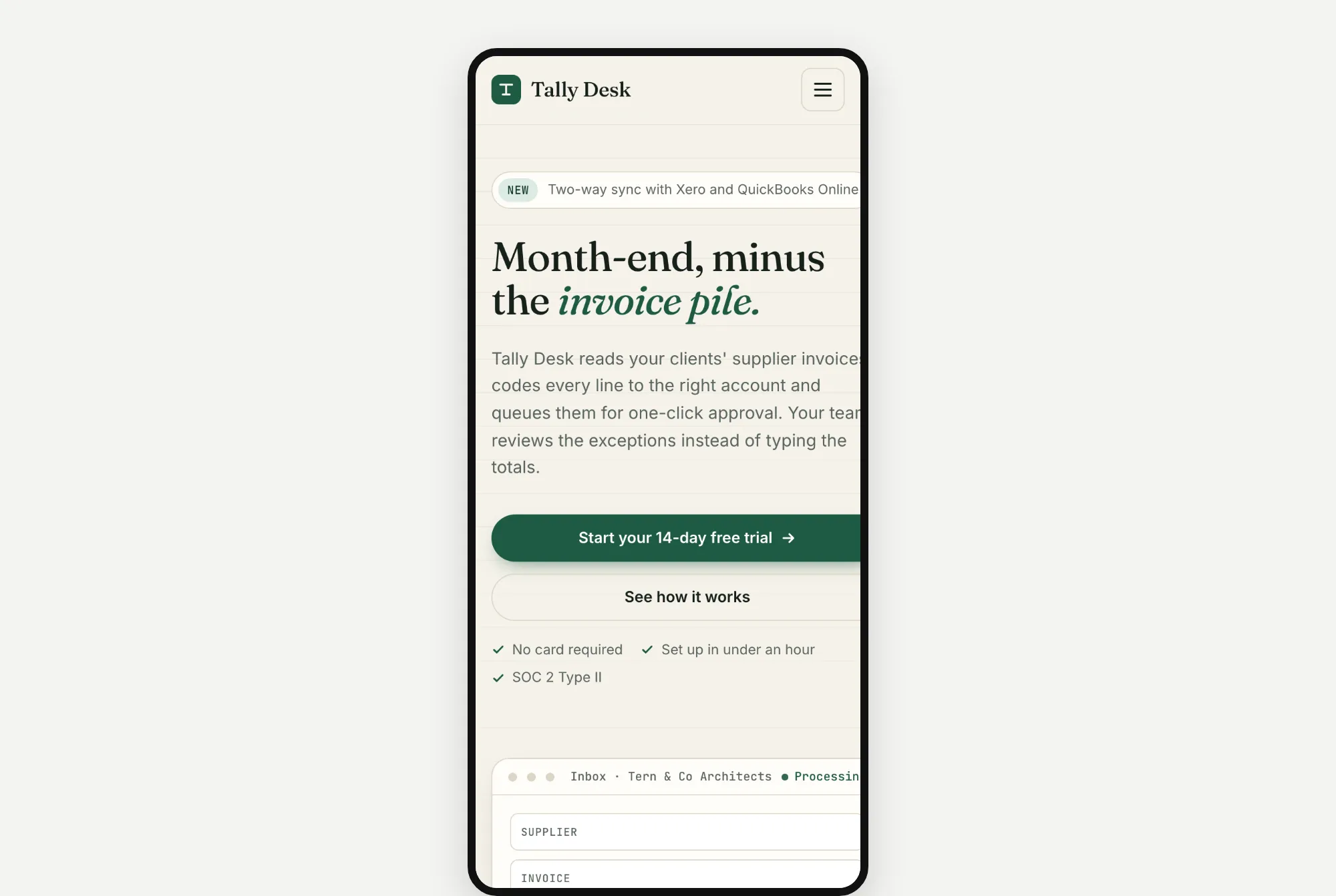
It looks good. There's a detailed fake inbox on the right, with a "2 flagged" note and an "11 sec average per invoice" tag. But on a phone, the page runs past the right edge of the screen. The buttons and the inbox get cut off.
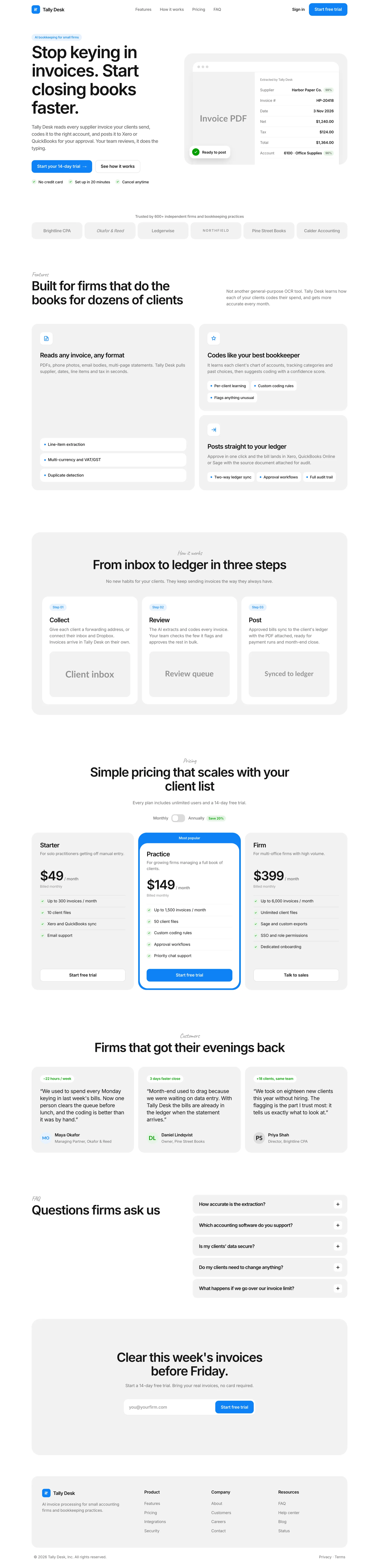
Opus 5.5's result took 2.5 minutes and cost $1.01.
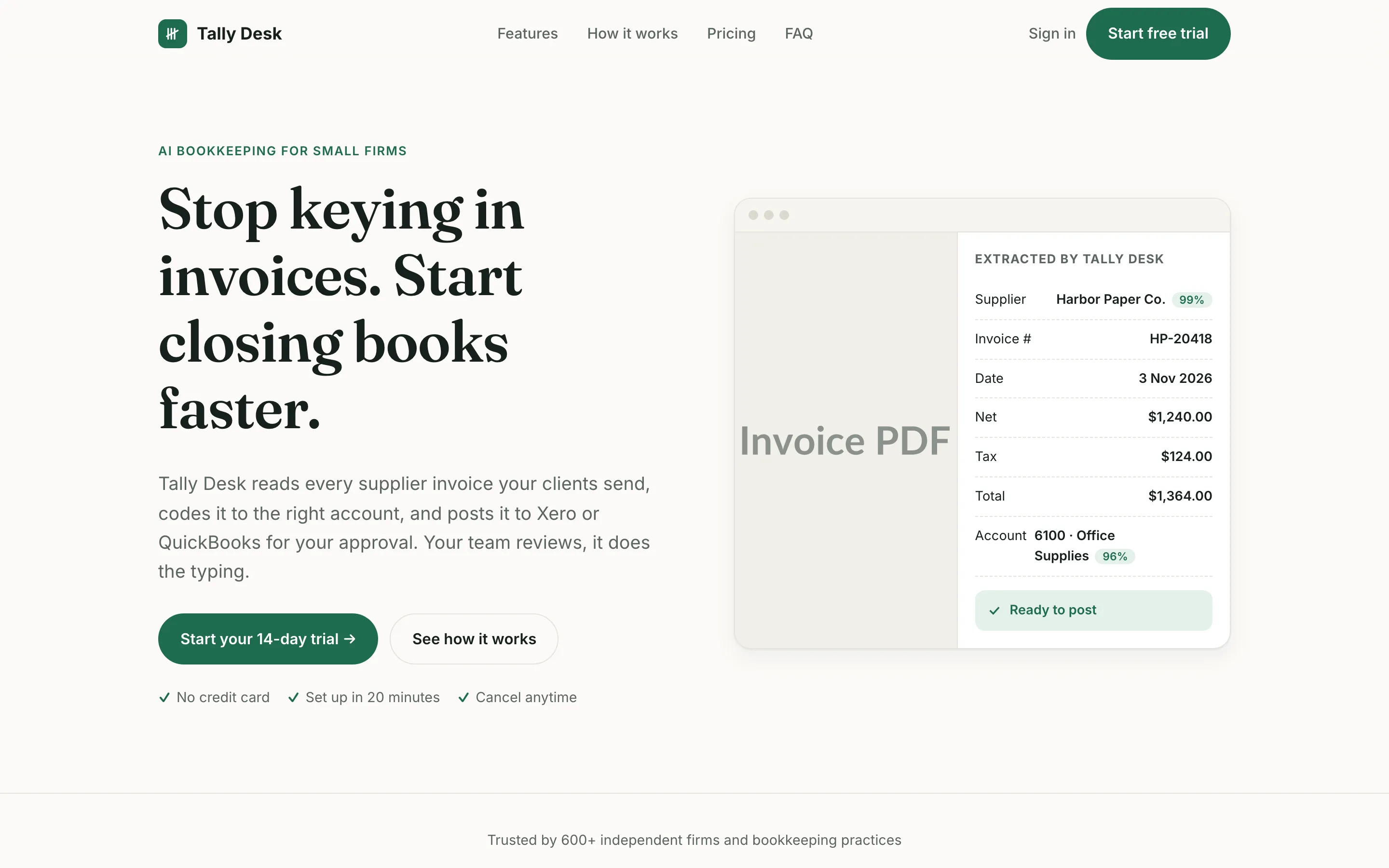
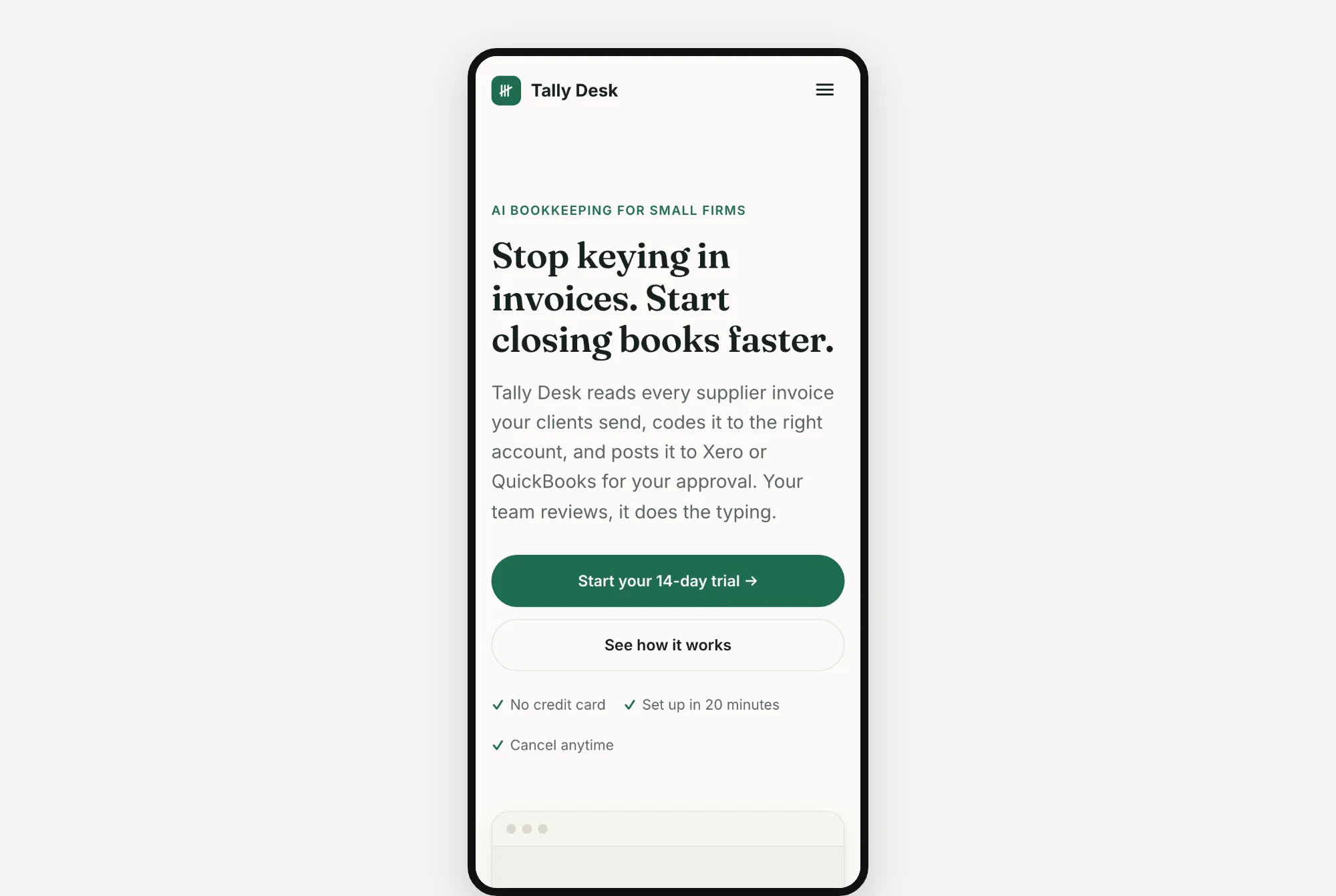
It's simpler. There's a grey "Invoice PDF" box next to the details the app pulled out of the invoice. The big "Invoice PDF" label pokes into the edge of its box. But it was done in about half the time, for half the cost.
Website 2: North Form, a design studio
The prompt:
Build a homepage for "North Form", a branding and web design studio that works with early-stage startups.

Sections: navigation, hero, selected work (4 projects), services, short about section with team, client testimonials, contact call to action, footer.

Write all the copy yourself. Build it as a single responsive page with HTML, CSS and vanilla JavaScript. Use placeholder images where needed.
Fable 5.2's result took 5.5 minutes and cost $2.45.
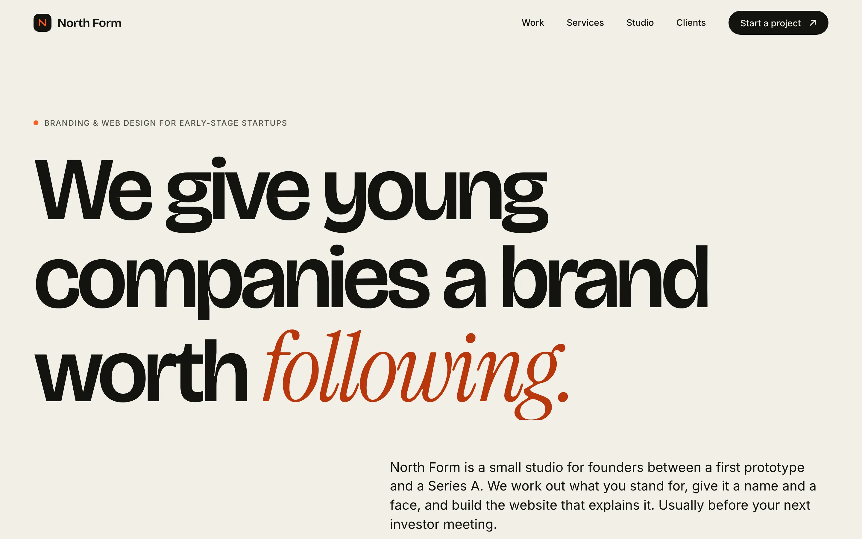
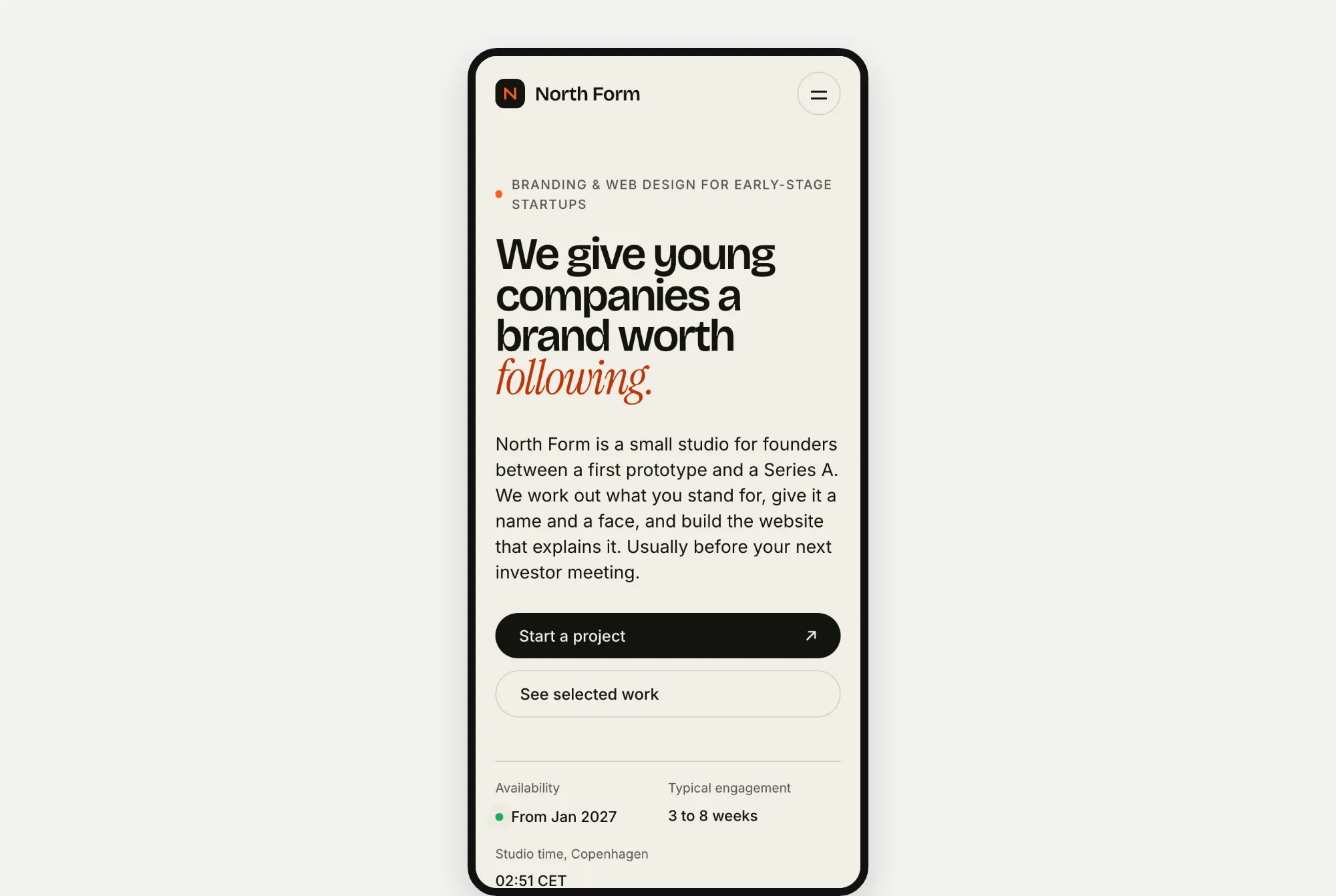
A cream page with a huge, bold headline. The last word, "following", is in orange slanted letters.
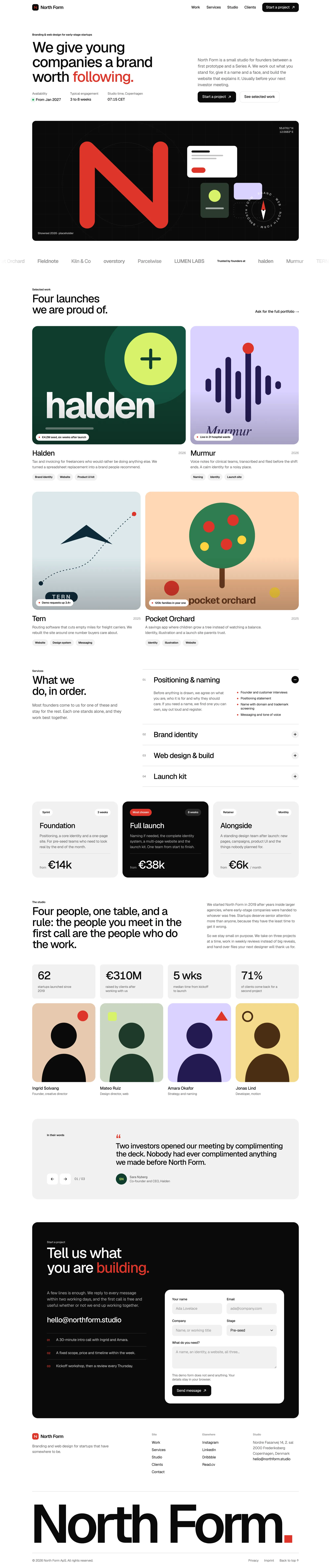
Opus 5.5's result took 2.7 minutes and cost $0.85.
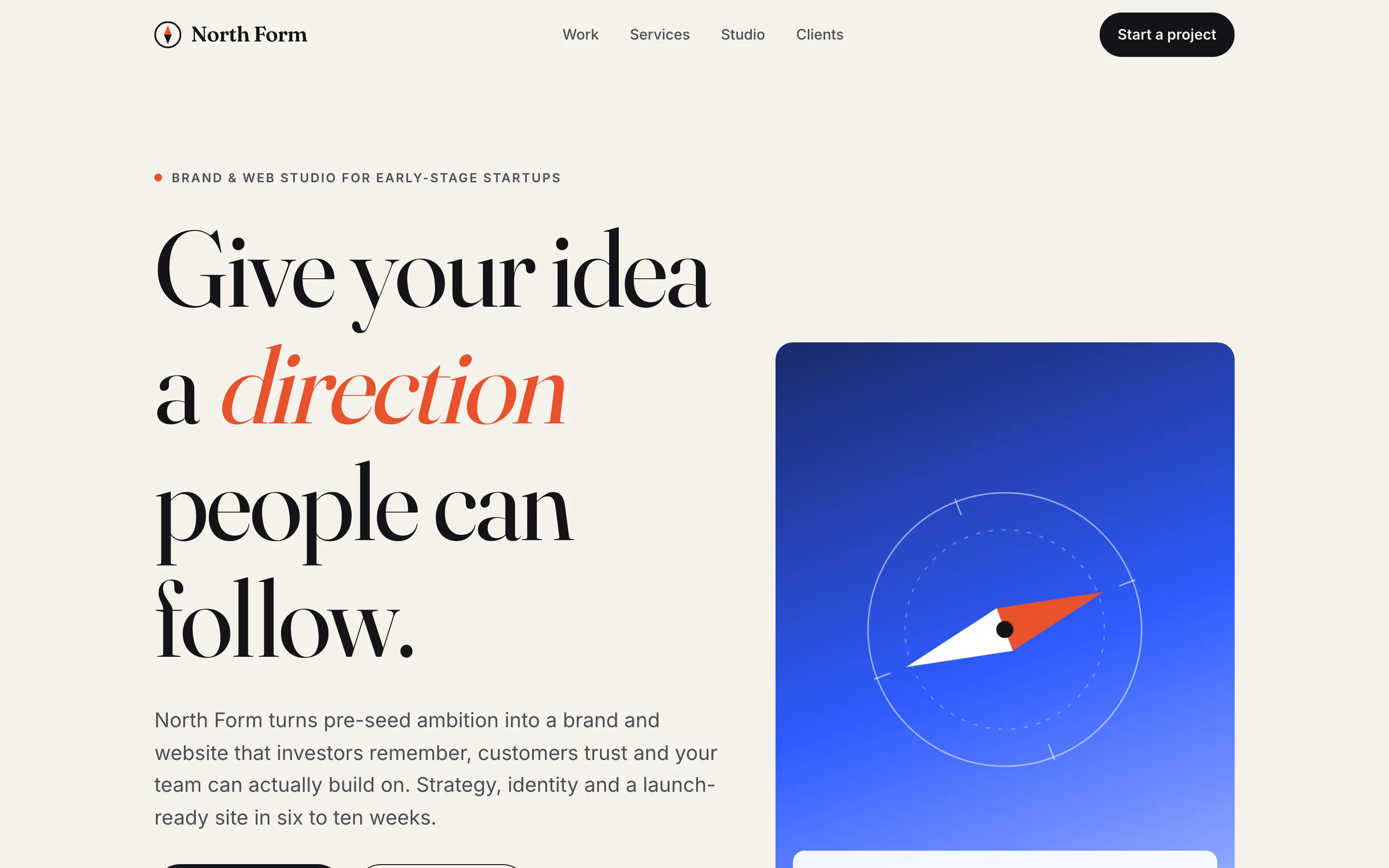
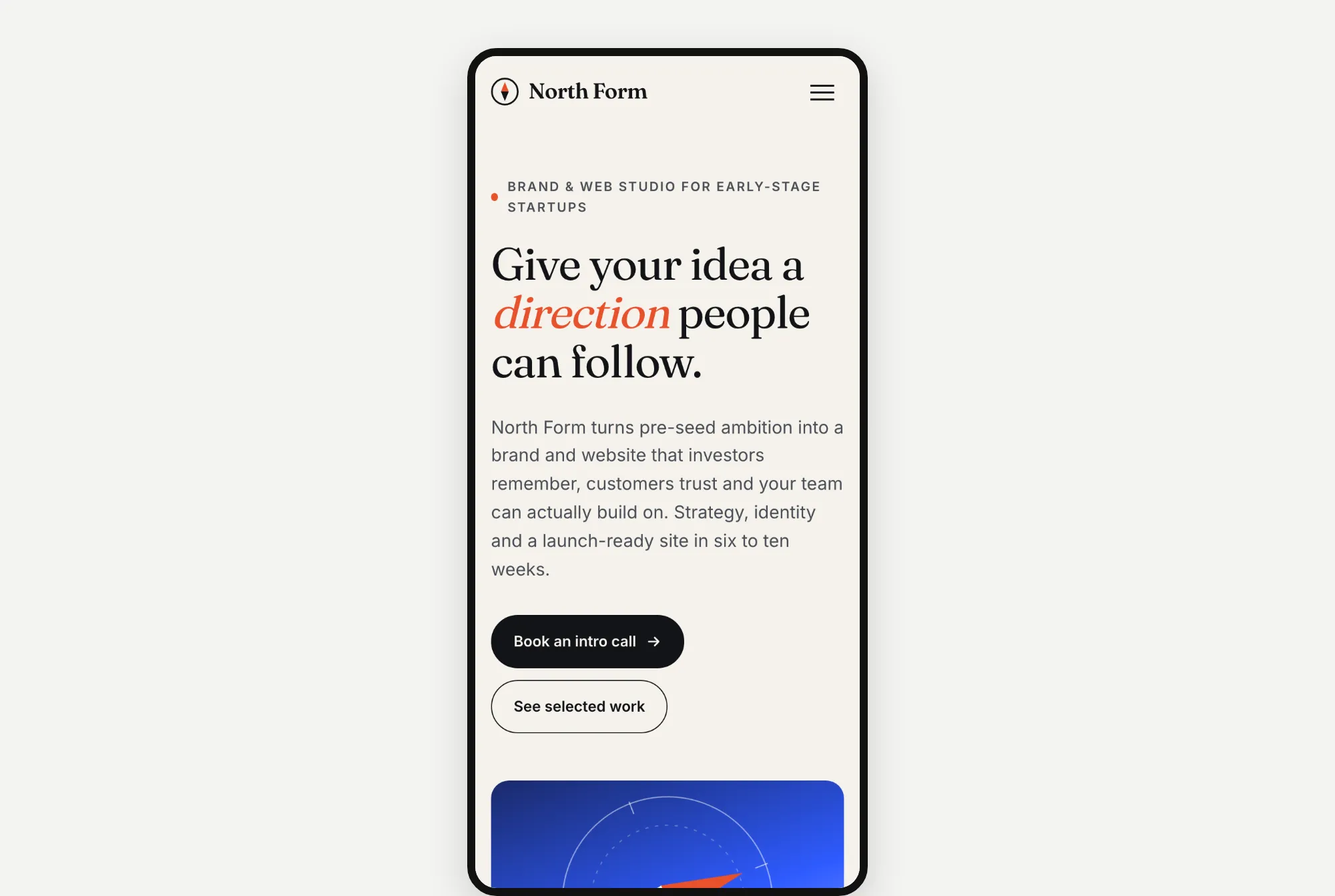
Also a cream page with one word in orange slanted letters, "direction". It adds a blue card with a compass. This was the only build that didn't check its own page in a browser before finishing.
Website 3: Kopi Sore, a coffee shop in Jakarta
The prompt:
Build a website for "Kopi Sore", a specialty coffee shop and roastery in Jakarta.

Sections: navigation, hero, our story, menu highlights (6 items with prices), the roastery, location and opening hours, Instagram gallery, footer.

Write all the copy yourself. Build it as a single responsive page with HTML, CSS and vanilla JavaScript. Use placeholder images where needed.
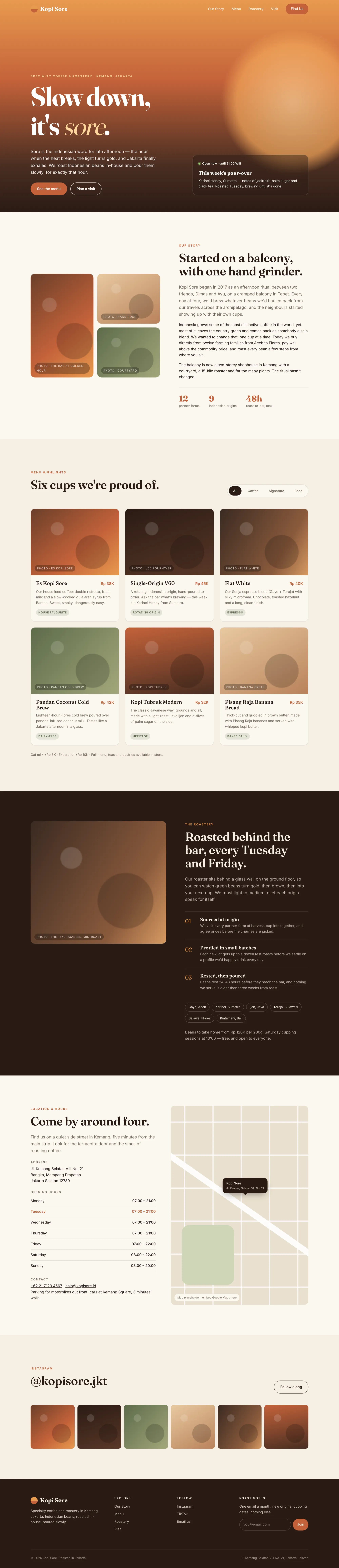
Fable 5.2's result took 4.4 minutes and cost $2.04.
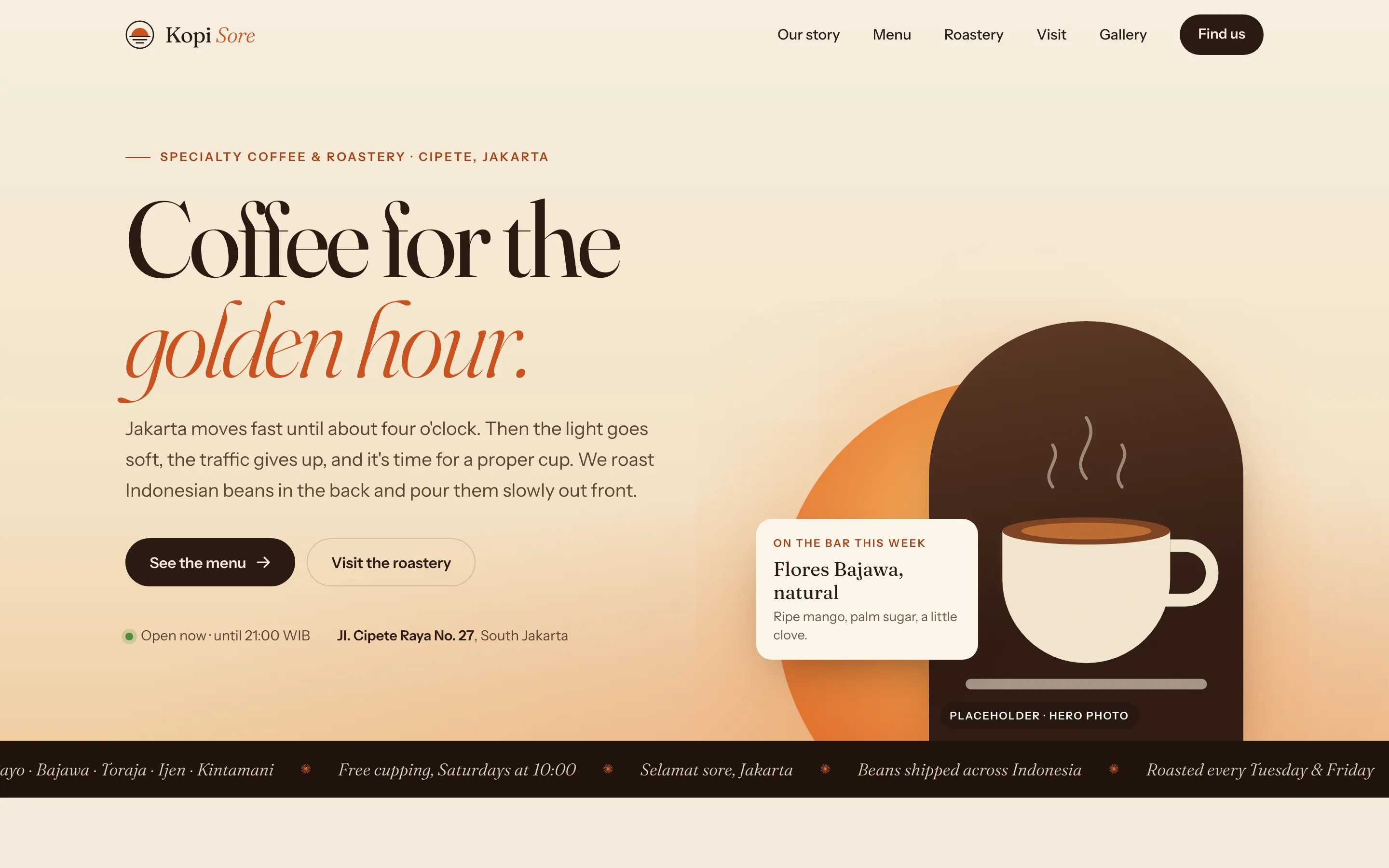
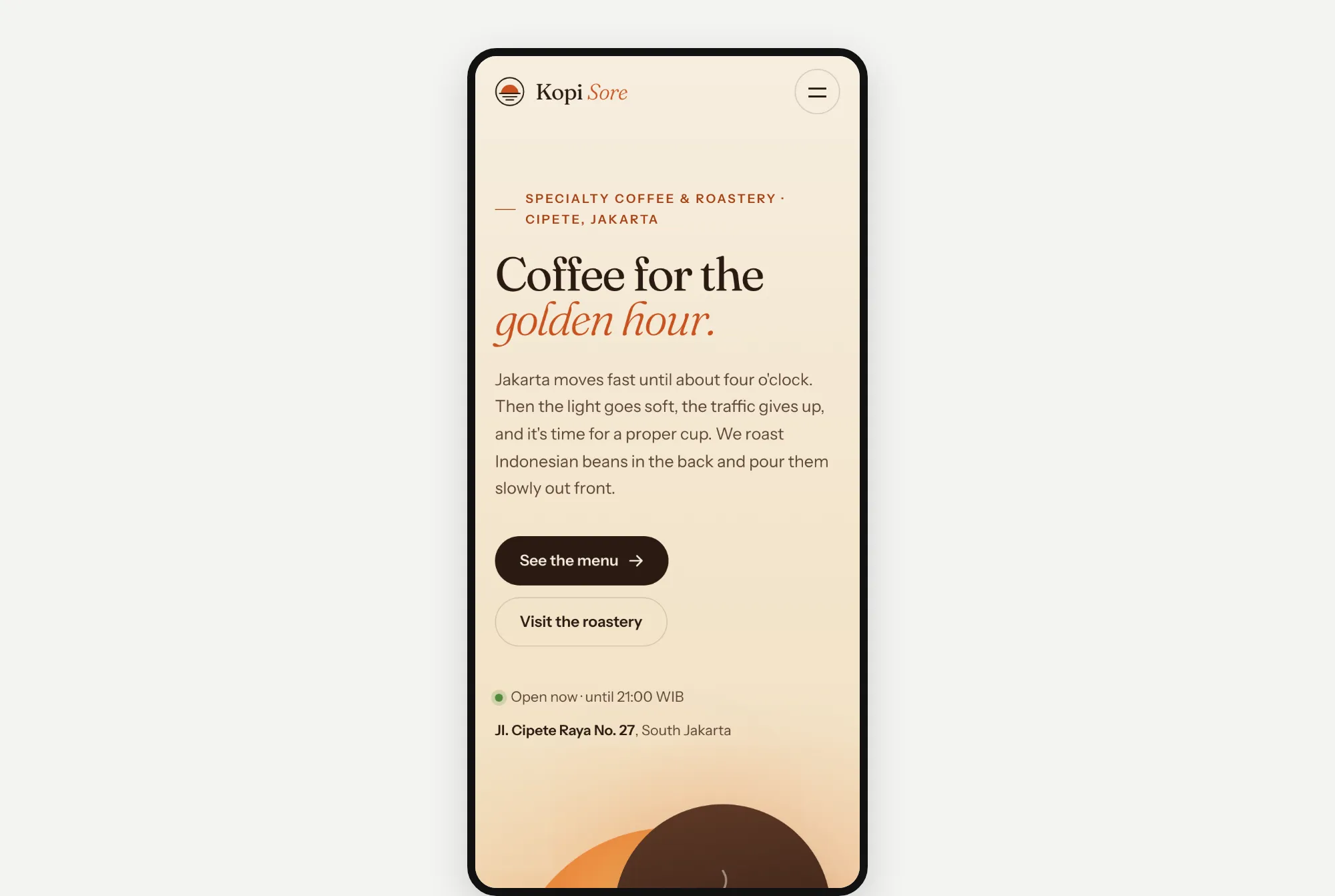
"Sore" means late afternoon in Indonesian, and Fable got it. It went with a sunset feel, a drawing of a coffee cup and a scrolling strip of coffee names.
Opus 5.5's result took 2.6 minutes and cost $0.90.
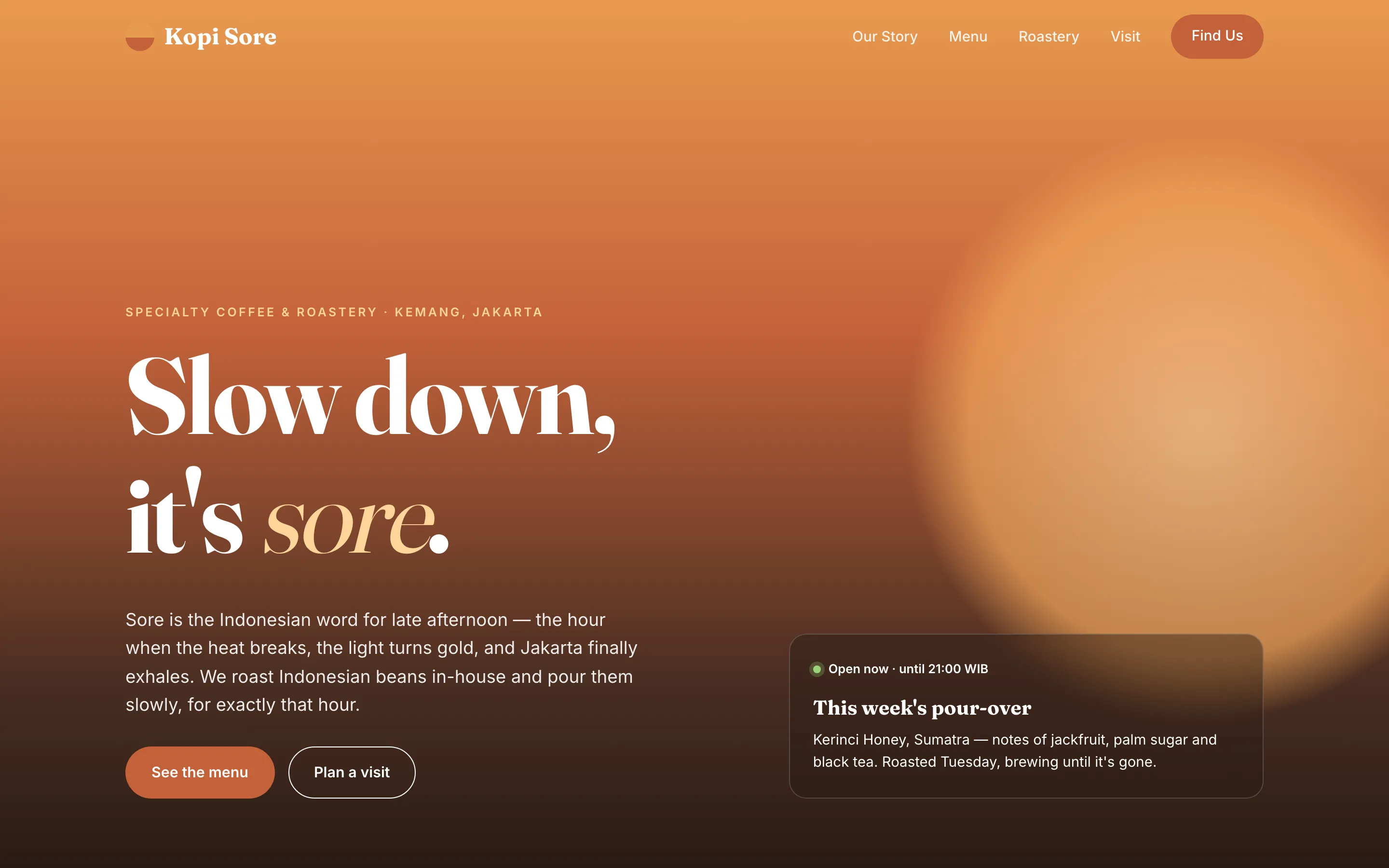
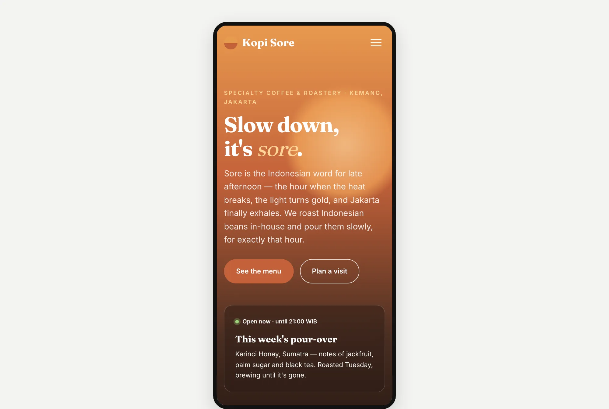
Opus also went with a sunset feel, using a big orange glow. Again, one word, "sore", is in slanted letters.
What I noticed: they made the same website
Put the six round 1 pages side by side, and the pattern is easy to see.
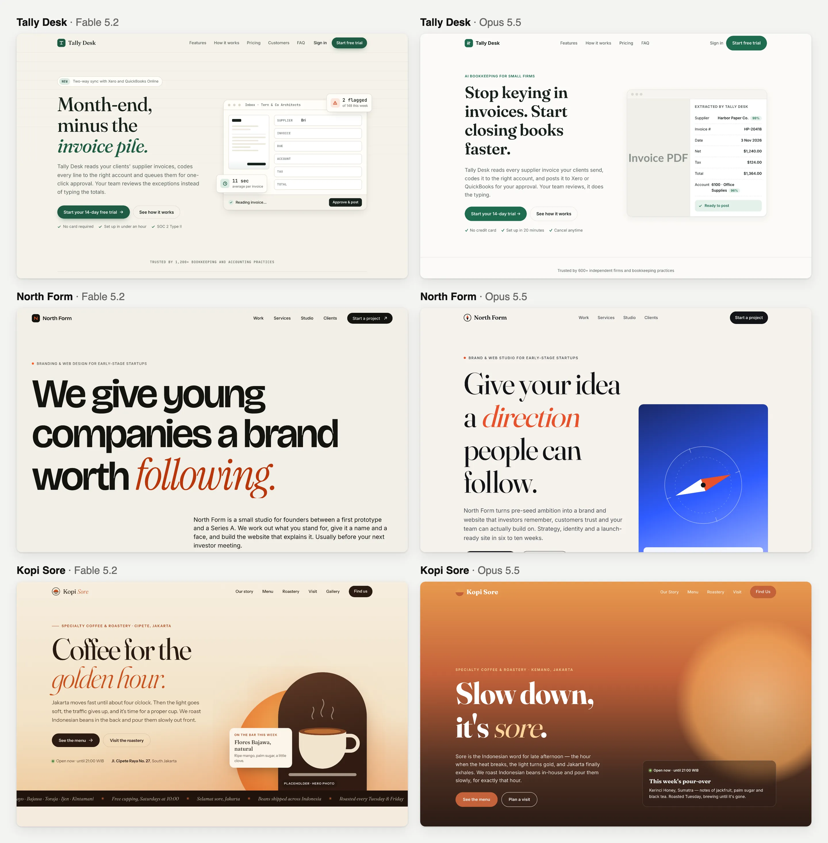
- All 6 have a cream or warm off-white background.
- 5 of 6 use the same headline font (Fraunces).
- 5 of 6 put one word of the headline in coloured slanted letters.
Two different models made three different businesses look almost the same. It's a nice look. But it's the look almost every AI-made website has right now. If you build sites for clients, that's a problem: every client gets the same "AI website". I wrote more about this in how to vibe code a website that doesn't look like AI slop.
Round 2: the same prompt, plus a Design.md guide
For round 2, I connected both models to the Velox Themes MCP. It lets the AI look through our templates, pick one that fits and read its Design.md guide. That's a written file of design rules, like which fonts, colours and spacing to use, and how things should move. To be clear, Velox Themes is my company. So I'll show you the weak spots too.
Each website got the same prompt as in round 1, plus this paragraph:
Before writing any code, use the Velox Themes MCP to get design direction for this site. Pick the reference that best fits this brand, then follow its layout structure, typography, spacing, colour palette and motion closely. Tell me which reference you chose and why, then build the page.Website 1: Tally Desk
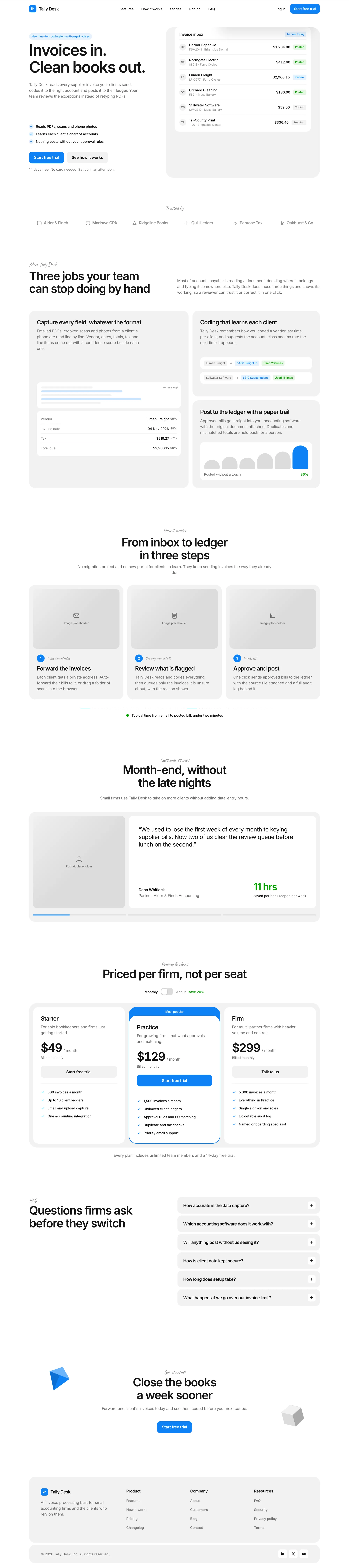
Fable 5.2's result took 6.1 minutes and cost $3.12. It picked our Kresna template, because Kresna is made for software companies.
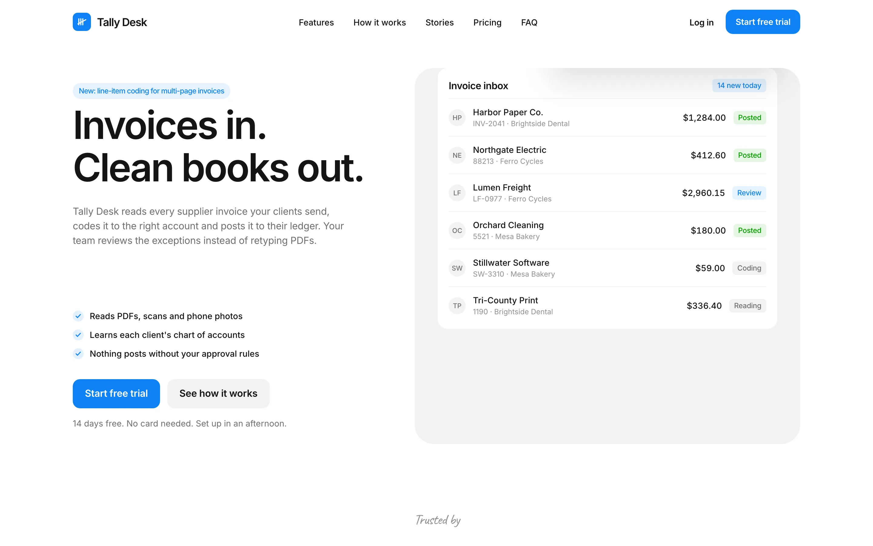
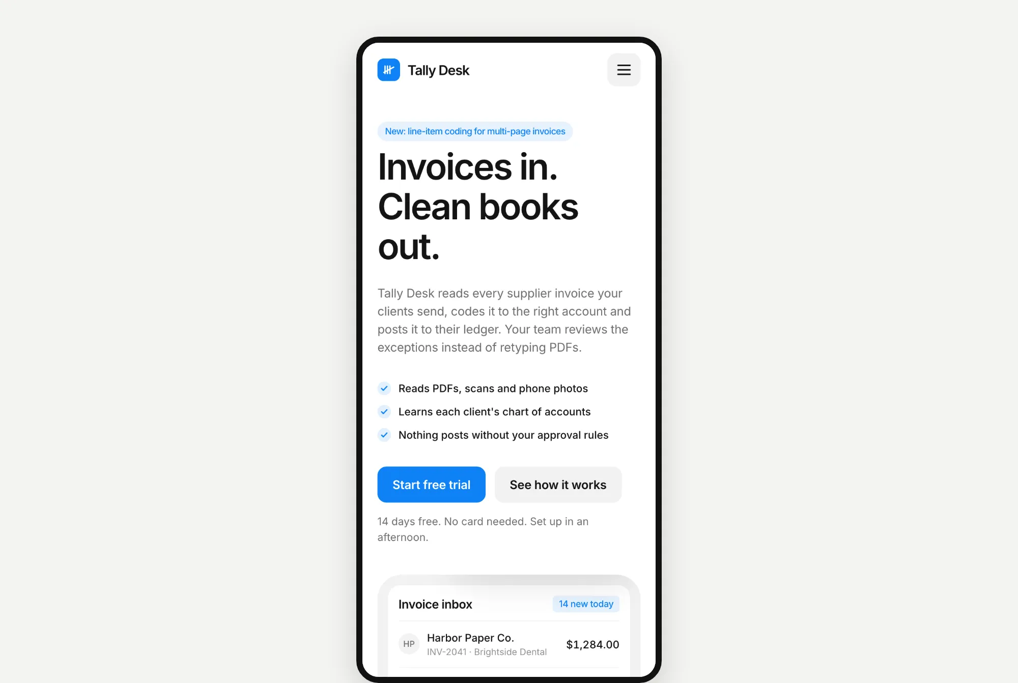
The cream is gone. It's now a clean white page with blue buttons and a list of invoices.
Opus 5.5's result took 9.2 minutes and cost $3.19. It also picked Kresna, for the same reason.
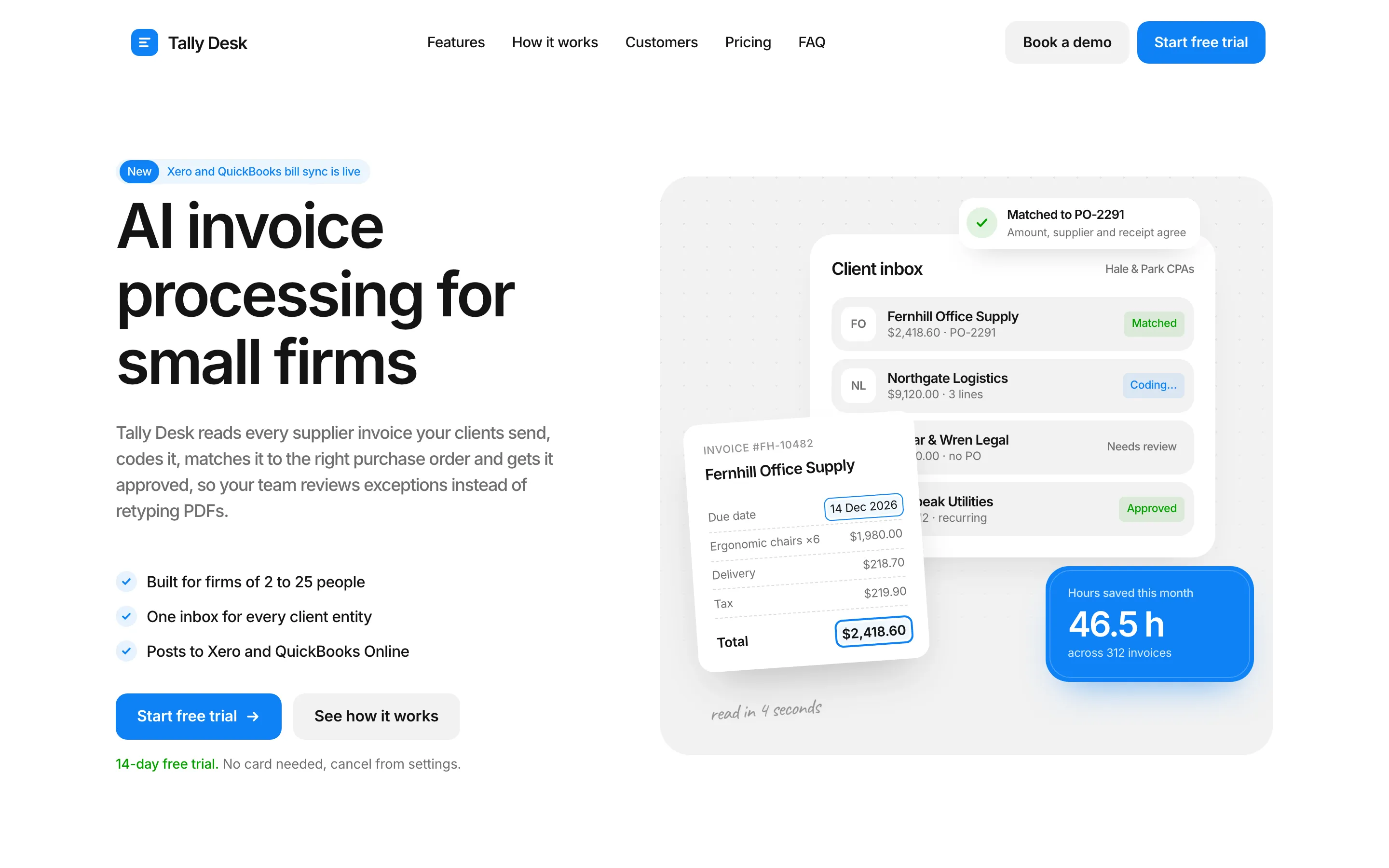
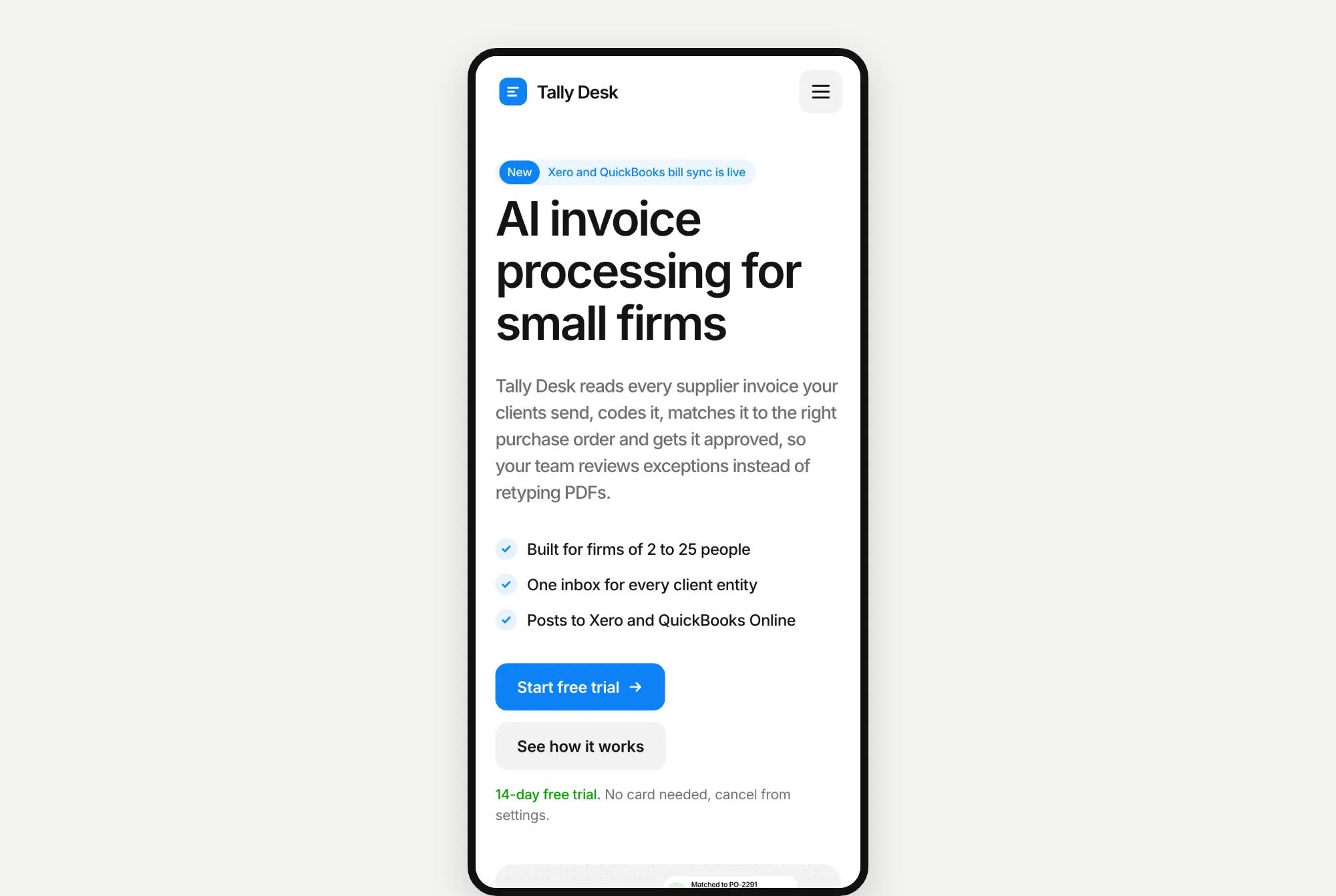
This time, Opus built the more detailed page, with stacked invoice cards and a bright blue number card. It was also the slowest build of all 18. That's because it checked its own page in a browser dozens of times before it finished.
Website 2: North Form
Fable 5.2's result took 6.8 minutes and cost $3.06. It picked our Kurawa template, which is made for design studios.
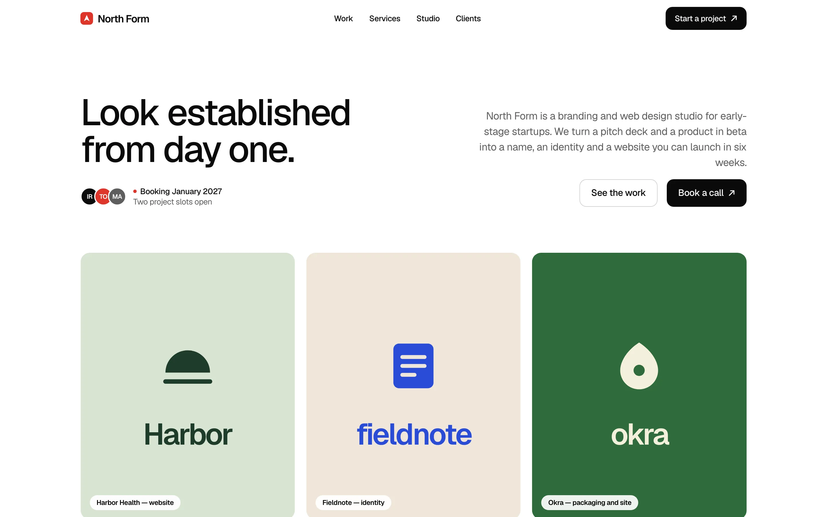
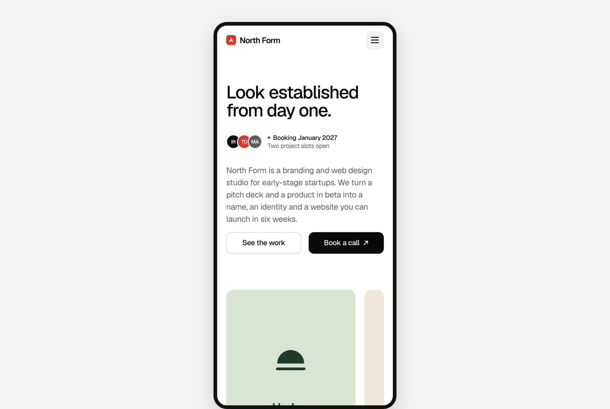
A white page with tight black text and three coloured project cards.
Opus 5.5's result took 7.1 minutes and cost $2.28. It also picked Kurawa.
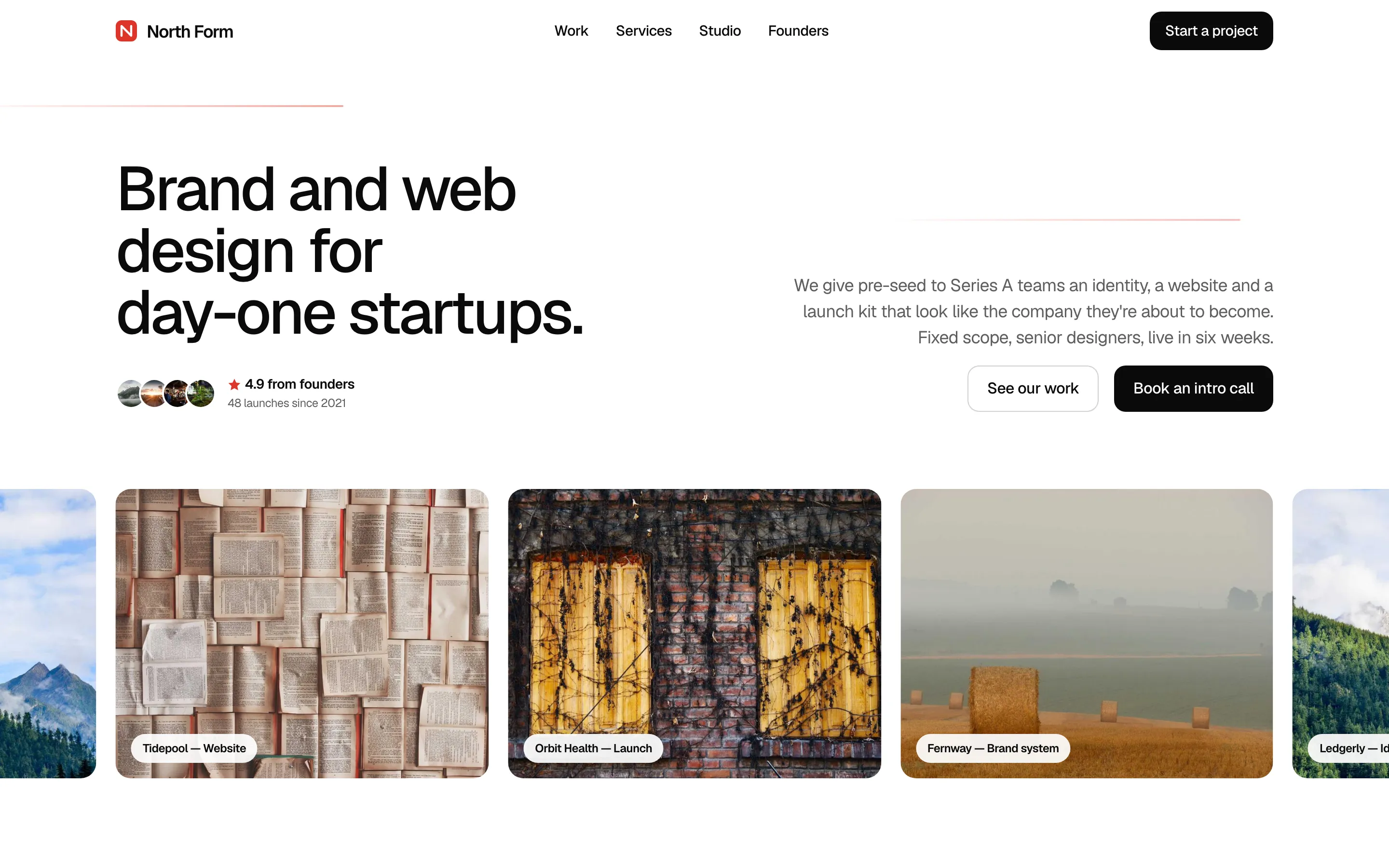
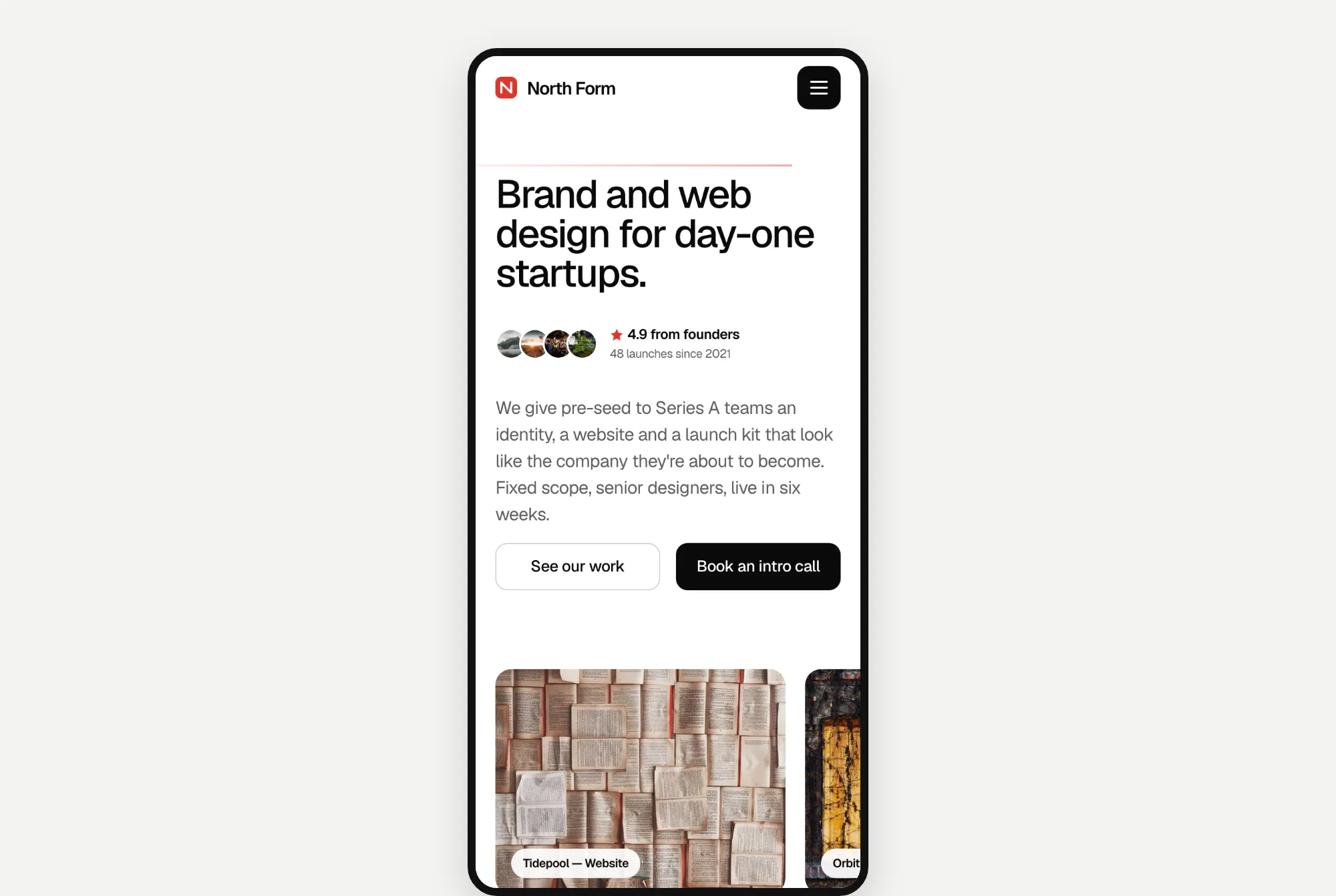
Same clean, white style. One honest note: Opus filled its project cards with random stock photos from picsum.photos, which the prompt allowed. That's why it looks more finished than Fable's coloured blocks.
Website 3: Kopi Sore
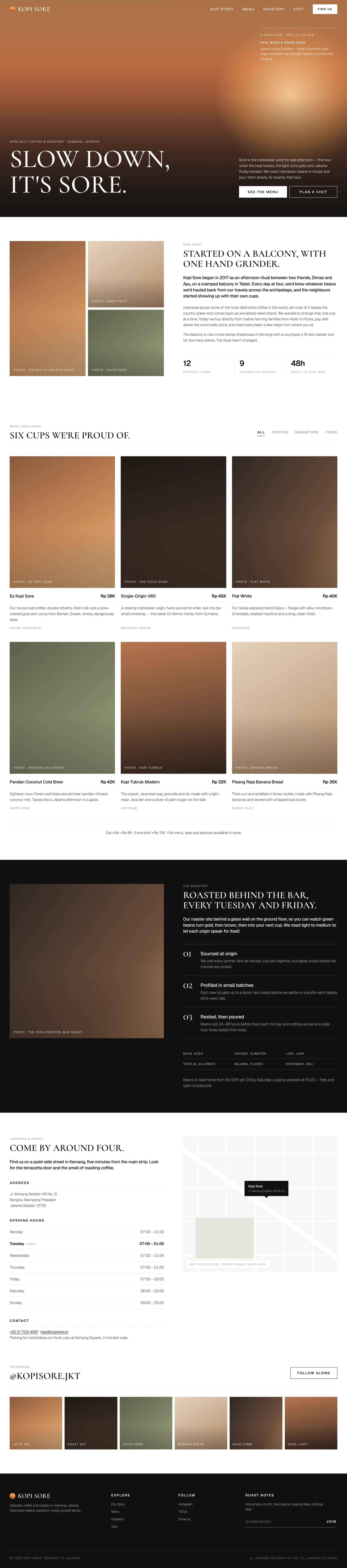
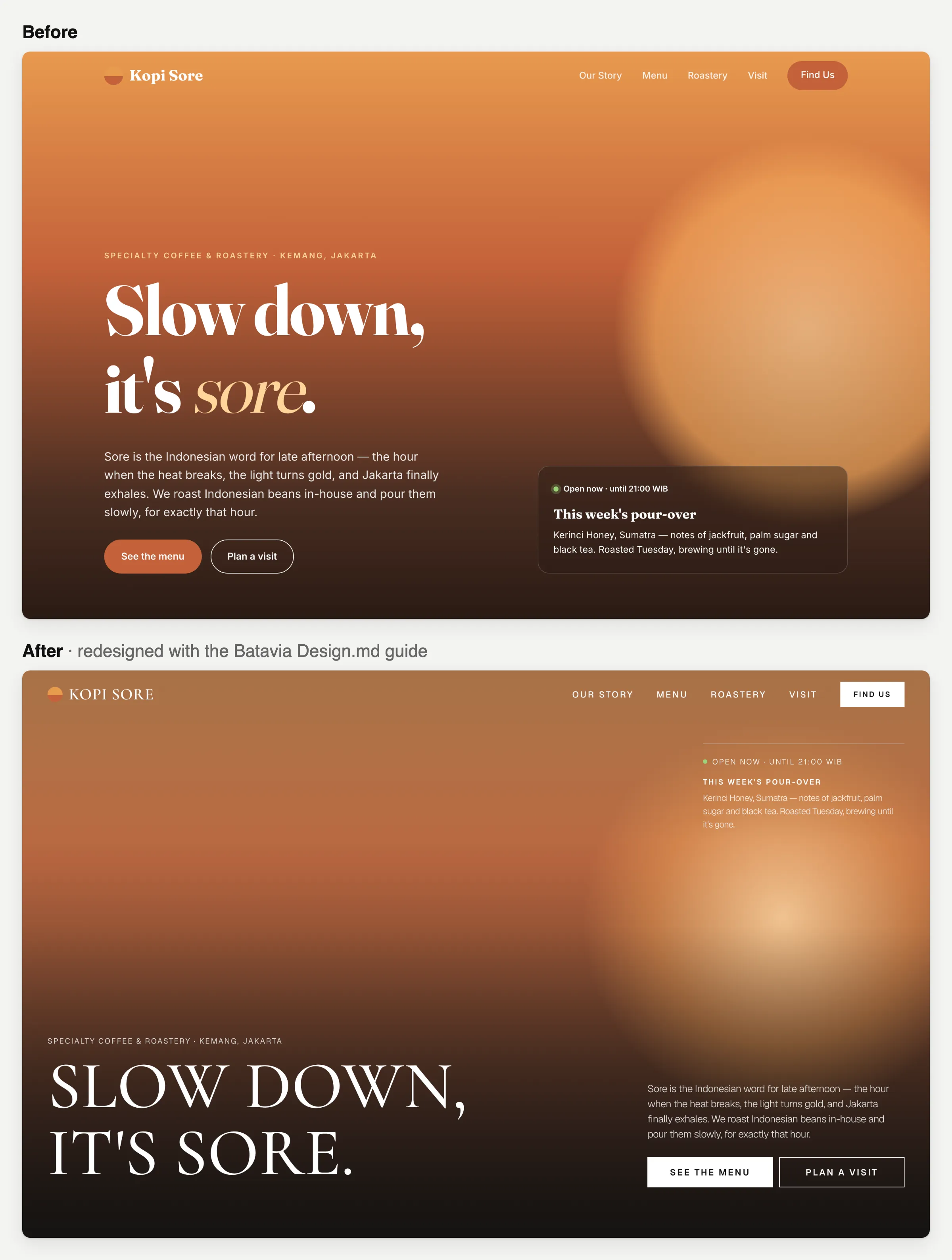
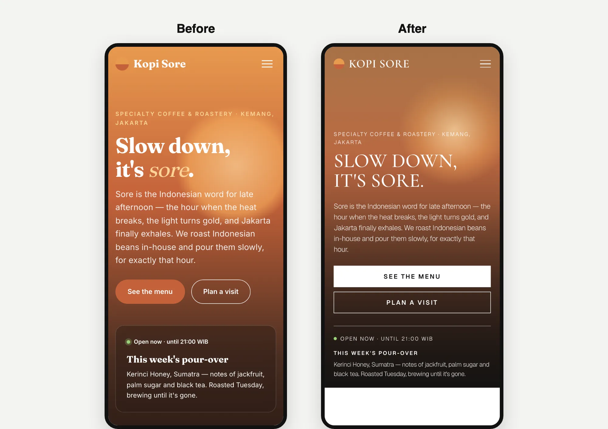
Fable 5.2's result took 5.8 minutes and cost $2.73. We don't have a coffee shop template, and Fable said so. It picked Batavia, a fashion shop template, because it's built around photos and a product list with prices, a bit like a menu.
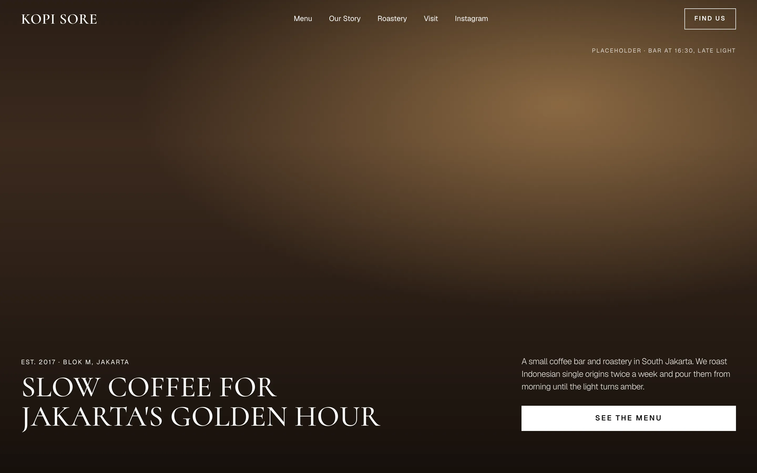
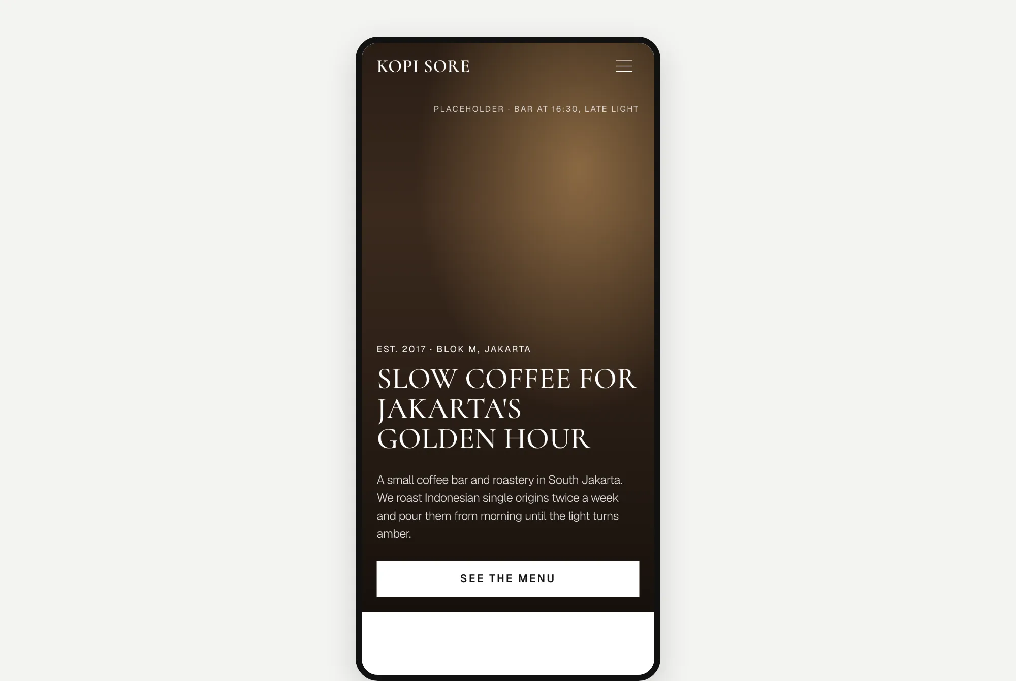
A dark, calm page with tall capital letters. Two weak spots: the top of the page takes about 5 seconds to fade in, and a "PLACEHOLDER" label is left on the photo. Both would need fixing before launch.
Opus 5.5's result took 5.0 minutes and cost $1.60. It also picked Batavia. It even pointed out that Batavia is the old name for Jakarta.
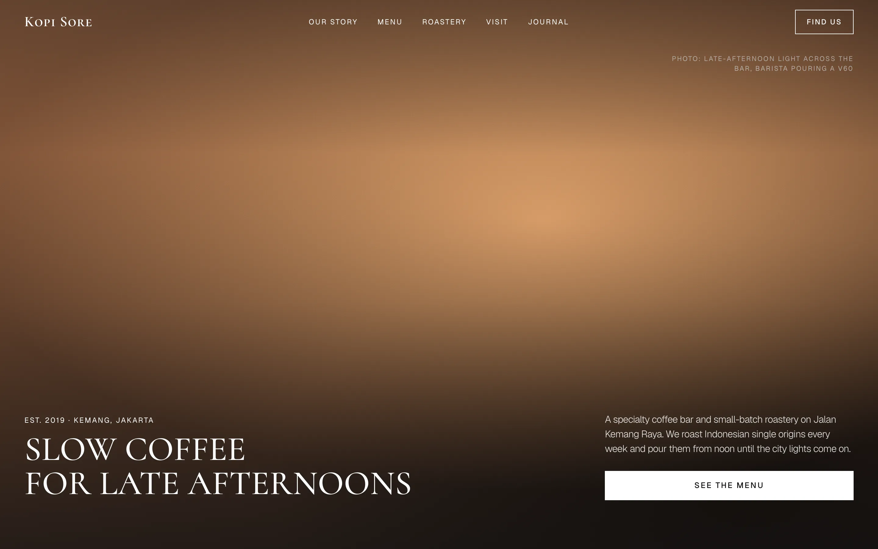
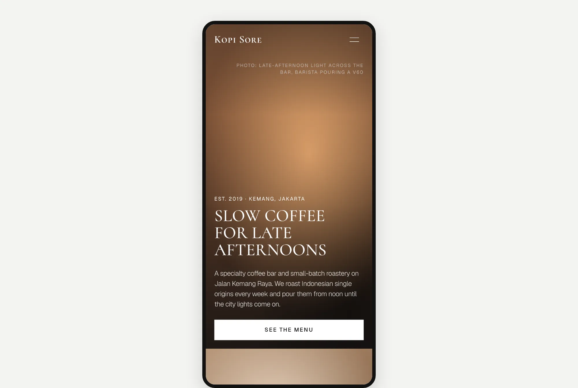
The two pages look almost like twins.
What I noticed: they picked the same designs
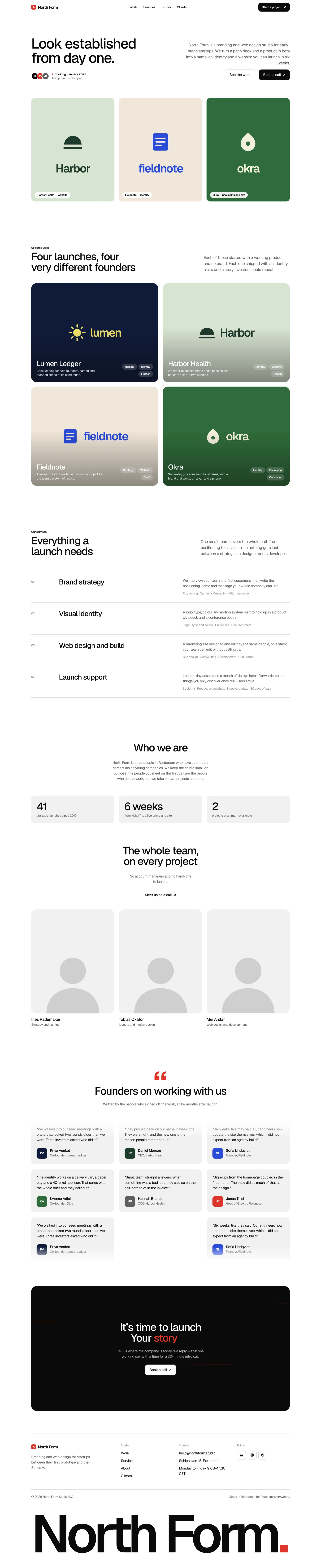
Both models picked the same template for every website, on their own. And once they followed the same Design.md guide, their pages looked like they came from the same designer. The cream-and-slanted-word look was gone from all six.
The speed gap also disappeared. With a Design.md guide, Opus took a little longer than Fable. But it still cost less.
Round 3: fixing the round 1 pages
For round 3, each model got a copy of its own round 1 page. I asked it to redesign the page with a Design.md guide, but keep the words and sections the same. Here's the prompt for Tally Desk. The other two only changed the name and description.
`model-comparison/tally-desk/velox-redesign/index.html` is an existing landing page for "Tally Desk", an AI tool that helps small accounting firms automate invoice processing. Redesign its UI from top to bottom using the Velox Themes MCP.

First use the Velox Themes MCP to find the reference that best fits this brand, and tell me which one you chose and why. Then go through the page section by section, from navigation to footer, and bring its layout, typography, spacing, colour palette and motion in line with that reference. Change only what you judge needs changing: keep the existing copy, section order and working interactions unless the design genuinely requires otherwise, and keep it a single responsive page in HTML, CSS and vanilla JavaScript.

Edit that file in place. Done means the redesigned `index.html` renders cleanly at desktop and phone widths, plus a short list of what you changed and what you deliberately kept.
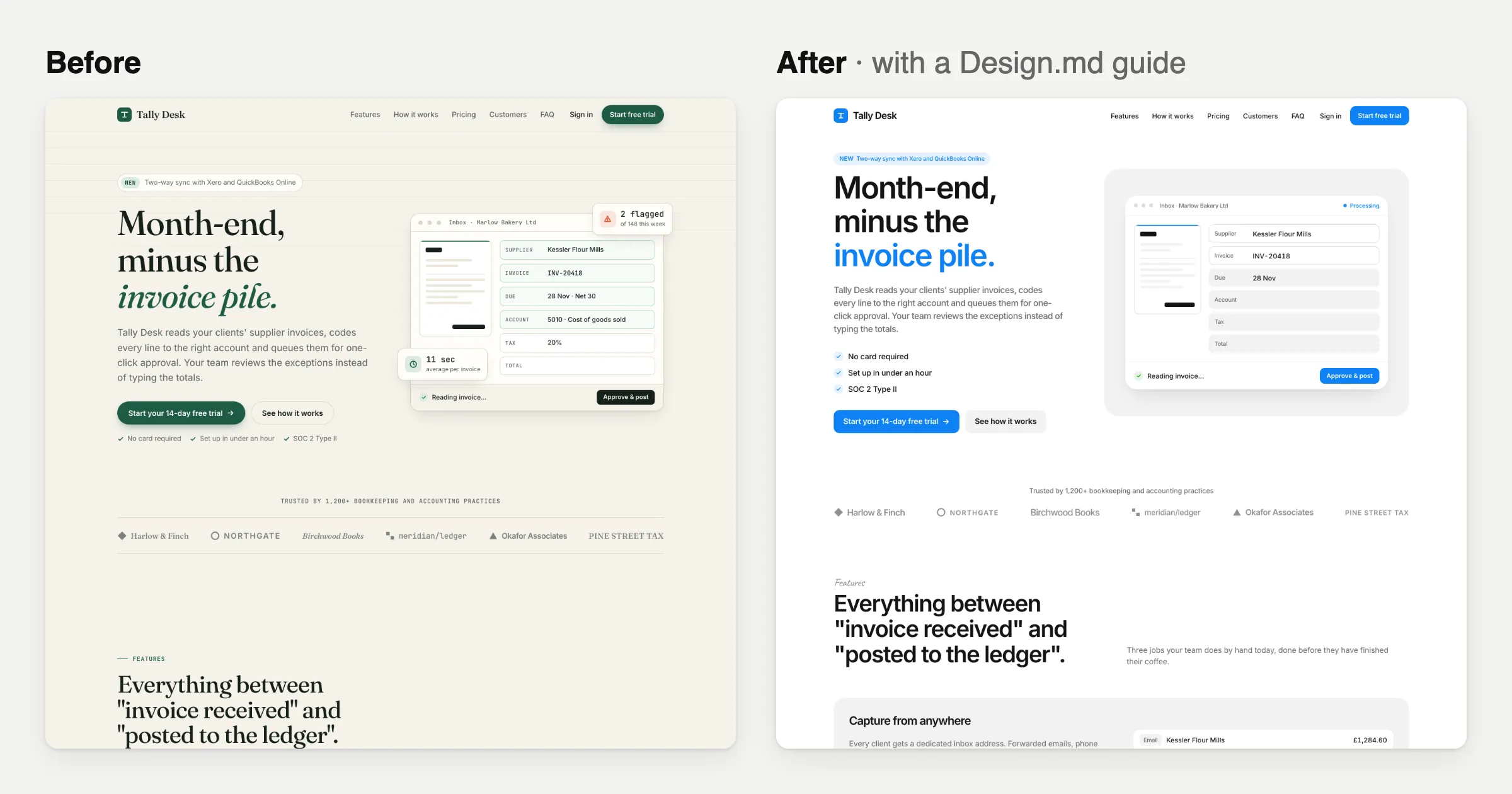
Website 1: Tally Desk
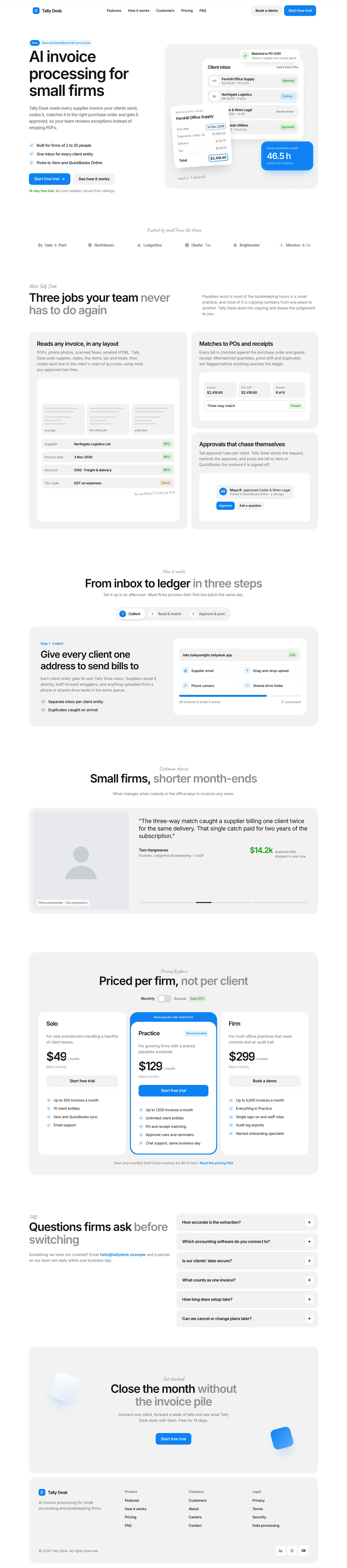
Fable 5.2's redesign took 7.0 minutes and cost $3.46. It picked Kresna again.
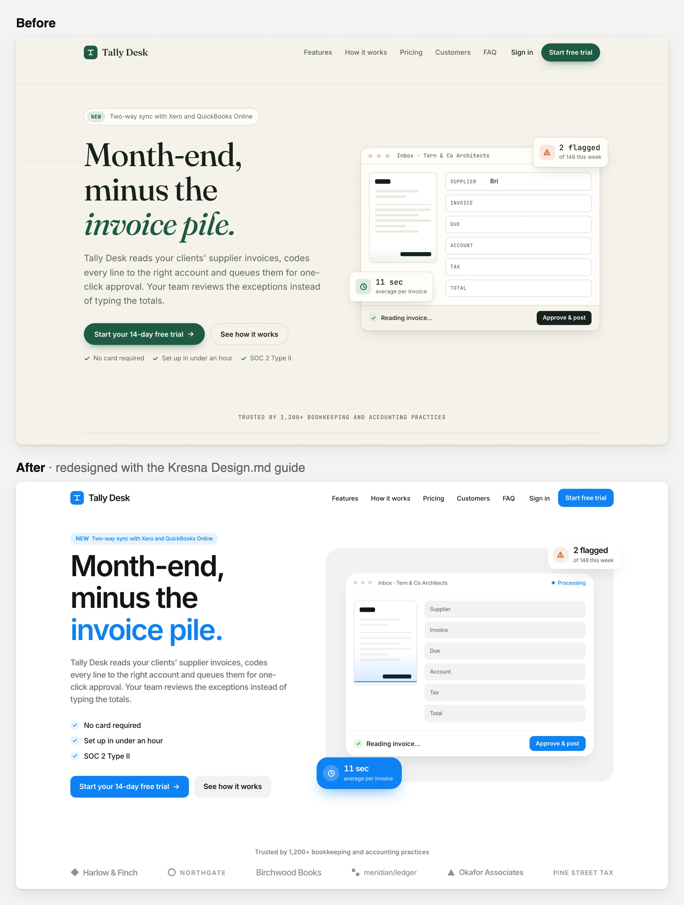
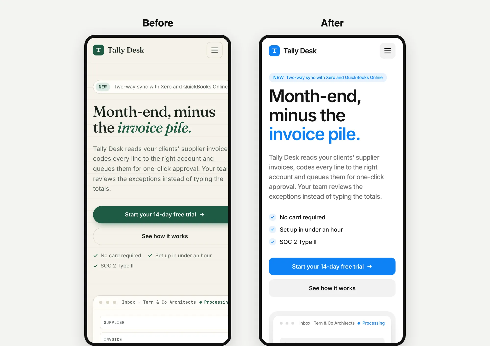
The words stayed the same. The cream and green turned into white and blue.
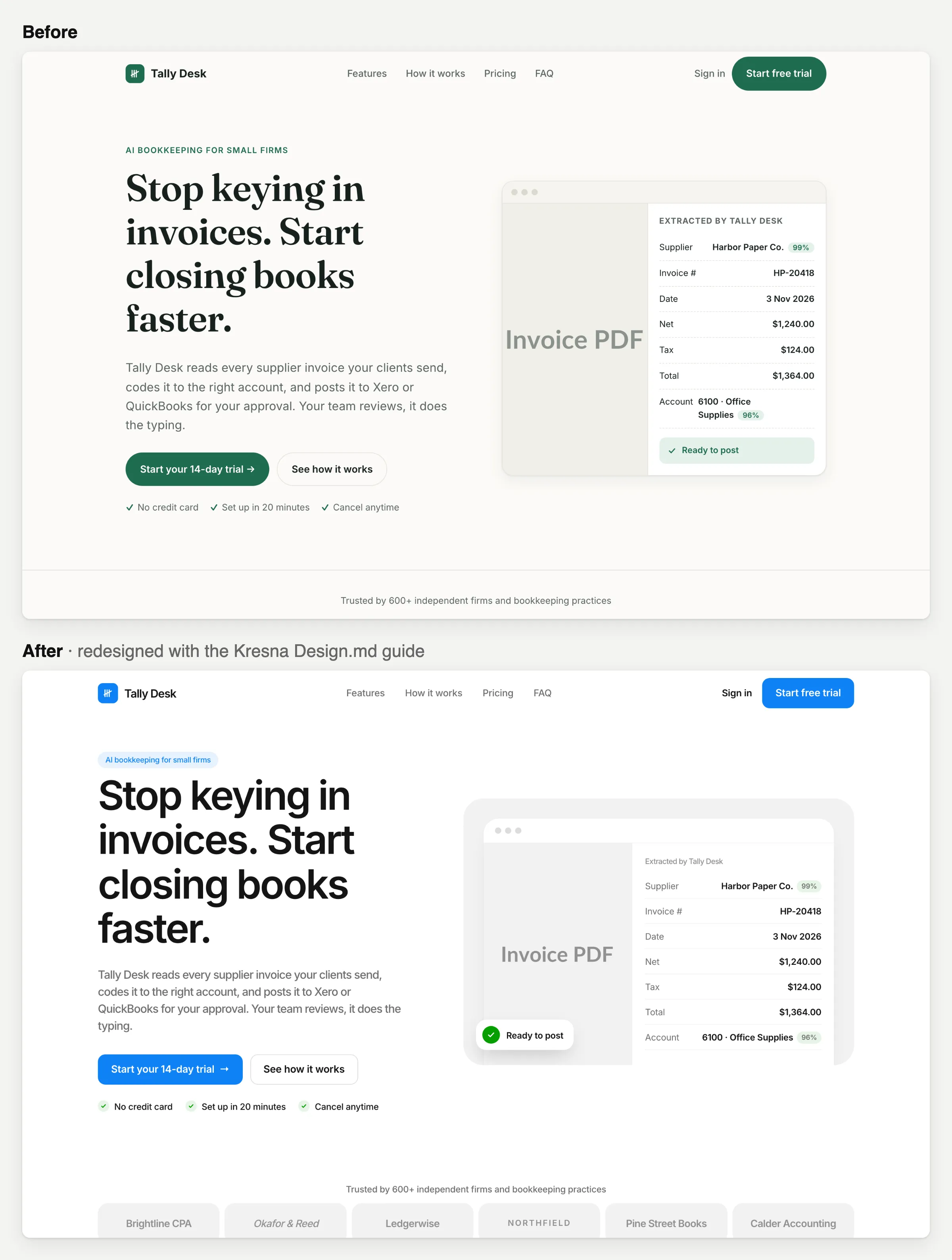
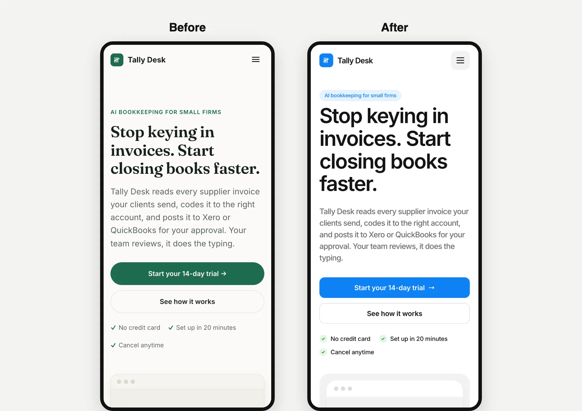
Opus 5.5's redesign took 4.8 minutes and cost $1.73. It also picked Kresna.
Website 2: North Form
Fable 5.2's redesign took 11.2 minutes and cost $5.26, the longest and most expensive build in the test. It picked Kurawa.
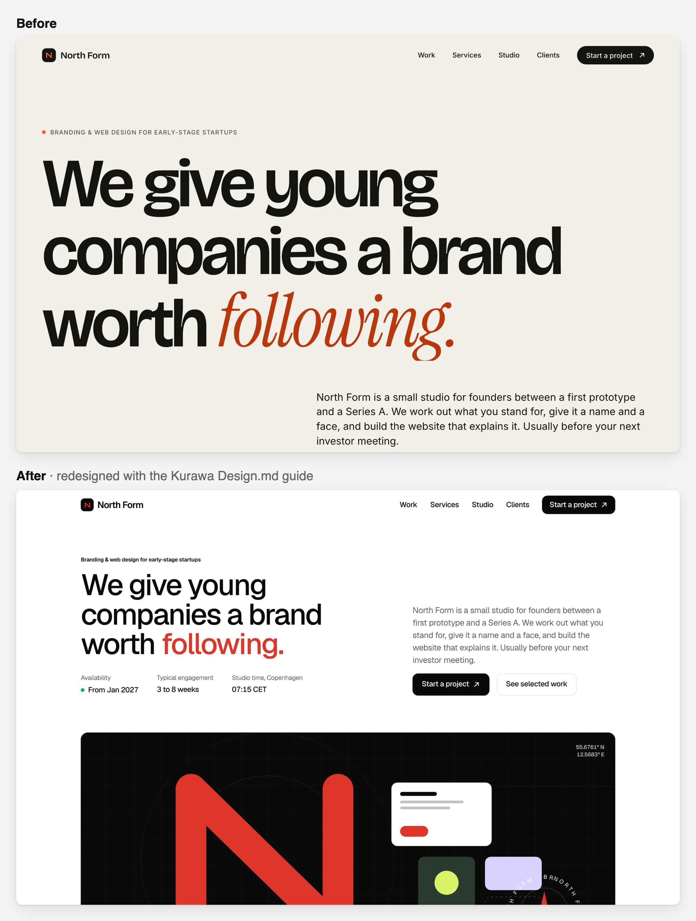
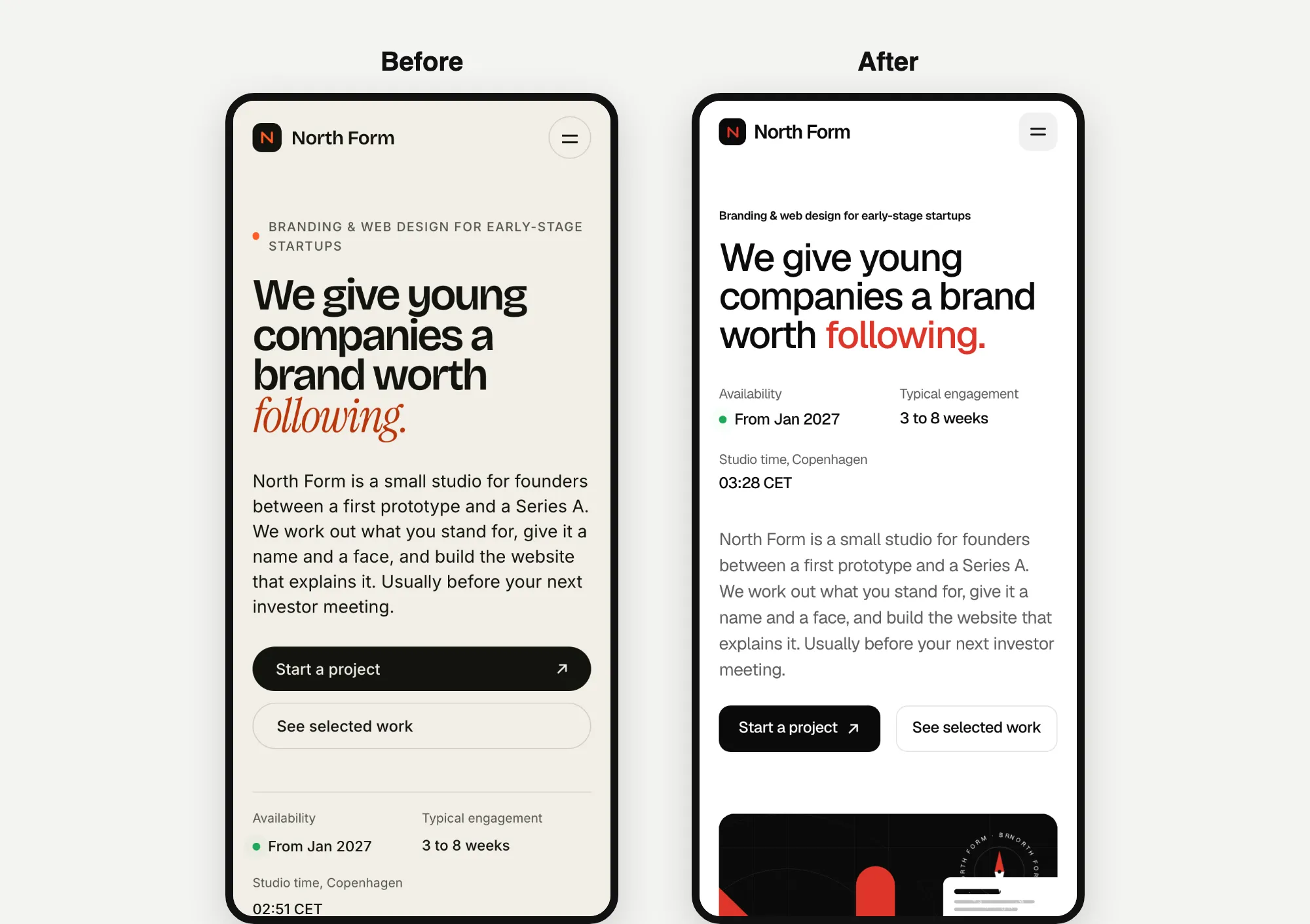
Opus 5.5's redesign took 8.1 minutes and cost $3.20. It also picked Kurawa.
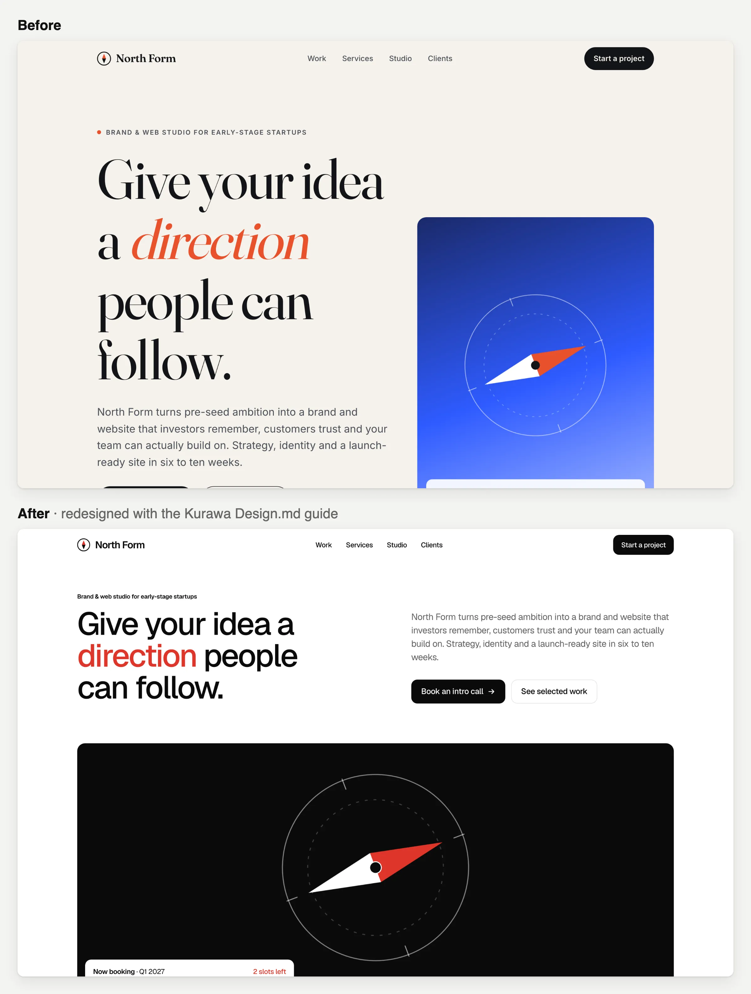
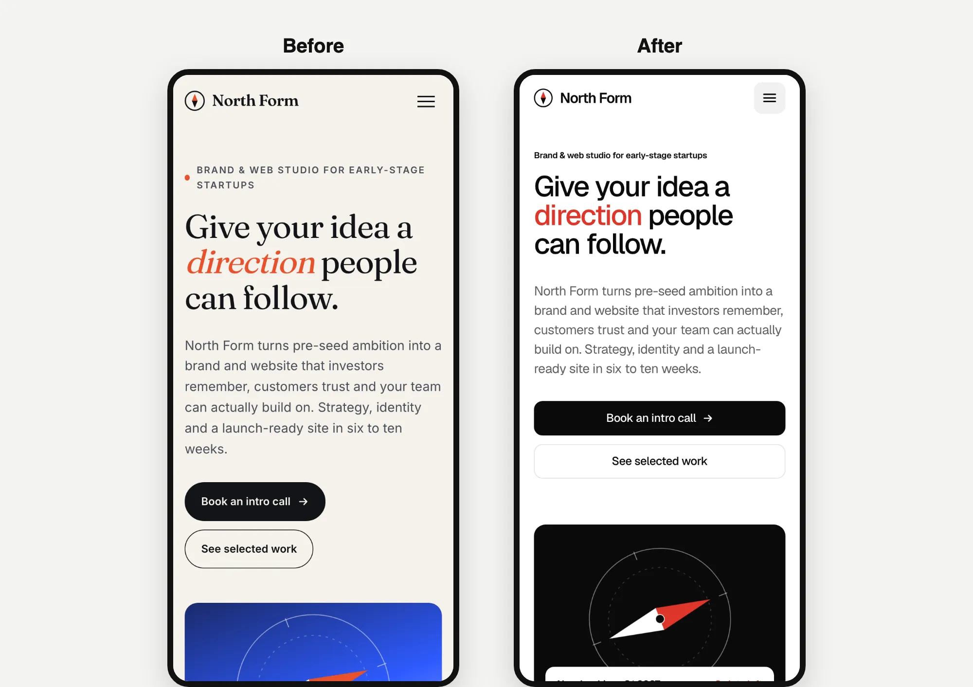
Both models also looked at another of our templates, Shinta, and turned it down as too playful for this studio.
Website 3: Kopi Sore
Fable 5.2's redesign took 7.5 minutes and cost $3.49. This time it picked a different template: Mandala, which has warm serif fonts and one bright yellow accent.
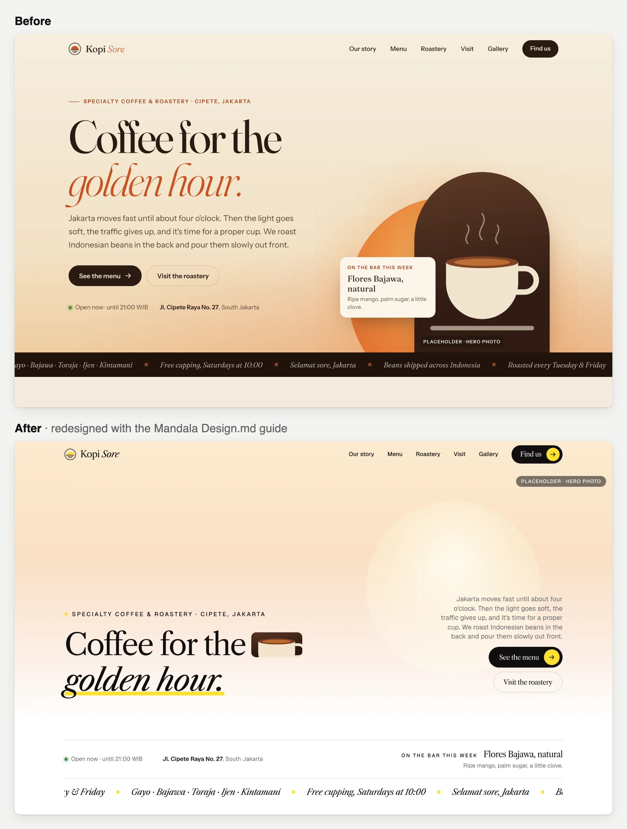
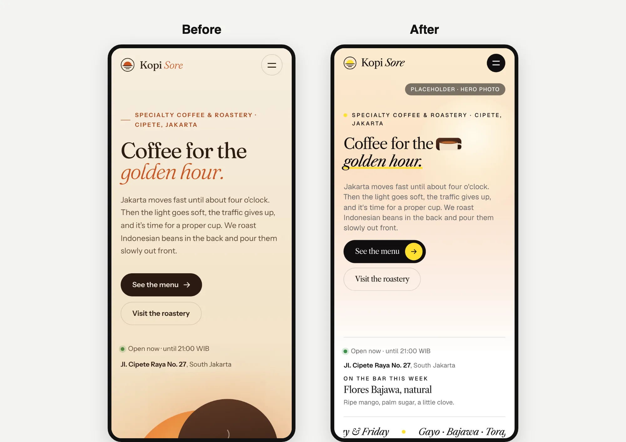
It kept the warm feel and added a small picture inside the headline. It still left a "PLACEHOLDER" label on the page.
Opus 5.5's redesign took 5.3 minutes and cost $2.07. It stayed with Batavia.
What I noticed
Kopi Sore was the only time the two models picked different templates. Everywhere else, they agreed.
One more honest note: none of these builds used our ready-made code. Every model read the written Design.md guide and rebuilt the look on its own. So the buttons and animations are the AI's own version of what the guide describes.
AI gets you to 80% fast. The last 20% is yours.
All 18 pages were good first drafts, and each one took less than 12 minutes. That's what AI is great at now: getting you from nothing to about 80%.
The last 20% still takes real time. It's where a website goes from "fine" to "polished". It's the motion and the small details. How does a button react when you hover over it? How do sections slide in? Does the spacing feel even? Do the two fonts work well together? How does it all feel on a phone?
My test found that last 20% on almost every page:
- A page that runs off the edge of a phone screen.
- A label that pokes into the side of its box.
- A top section that takes 5 seconds to appear.
- A "PLACEHOLDER" tag left on a photo.
So plan for a few rounds. Look at the page, ask for fixes and look again. Web design with AI is still a conversation, not one message.
Where a Design.md guide helps
I build templates every day, and this is where I see a Design.md guide help most. A Design.md guide gives the AI real design rules: fonts, sizes, spacing, colours and motion. So your first draft starts from a real design, not the same cream page everyone gets. Then you can spend your time on the last 20%, tweaking it until it feels right.
To be fair, this test measured looks, time and cost. It didn't measure how many rounds of fixes each page needs to be finished.
What Anthropic's own tests say
Before launch, Anthropic tested its models on hard tasks and shared the scores. These tests aren't about websites. But the coding, computer-use and chart-reading tests are the closest to what building a website needs. Higher is better.
| Test (what it checks) | Fable 5.2 | Fable 5.1 (older) | Opus 5.5 |
|---|---|---|---|
| FrontierCode 2.0 (coding on its own) | 49.1% (Xhigh effort) | 32.4% (Xhigh effort) | 45.5% |
| FrontierSWE v2 (coding on its own) | 69.9% | 56.3% | 62.3% |
| OSWorld 2.1 (using a computer) | 89.3% | 83.5% | 87.2% |
| Chartography (reading charts, no tools) | 73.4% | 44.8% | 64.4% |
| Humanity's Last Exam (hard questions, with tools) | 74.2% | 65.6% | 67.7% |
Source: Anthropic's Fable 5.2 launch post, 9 November 2026. Anthropic ran each model at its highest effort setting. I used medium, so my results won't match these gaps exactly. The full method is in the system card.
Fable 5.2 wins every row here. On its product page, Anthropic calls it "our best model for designing objects for the real world and on screens". The launch post says it's up to 30% faster than Fable 5.1. But the same post also suggests most people start with Opus 5.5 for coding, and switch to Fable for the hardest jobs.
What each model costs
| Price per million tokens | Fable 5.2 | Opus 5.5 |
|---|---|---|
| Text the AI reads | $8 | $4 |
| Text the AI writes | $40 | $20 |
Source: Claude API pricing, 10 November 2026. Tokens are small pieces of words. AI companies charge for every token the AI reads and writes. Fable 5.2 is cheaper than Fable 5.1 was ($10 and $50). But it still costs twice as much as Opus 5.5.
What public scoreboards say
Some websites rank AI models by having people vote on their designs. Here's what three of them showed on 10 November 2026. They change every day.
- Arena WebDev: Fable 5.2 was #1 with 1832 points, but that was an early estimate with no votes yet. Opus 5.5 was #2 with 1818 points, from 4,009 votes.
- Design Arena: Opus 5.5 was #1 overall with 1462 points. Fable 5.2 wasn't in the top 15 yet.
- Artificial Analysis: Fable 5.2 ranked #1 of 74 models for intelligence. It was also the most expensive to run on their tests, at $26.54 per task.
On paper, the two are close for website work. That's why I ran my own test.
Which one should you use for websites?
Pick Fable 5.2 when
- You want the most detail in your first draft.
- The page is big or tricky.
- Getting closer on the first try matters more than the cost.
Pick Opus 5.5 when
- You want fast, cheap drafts, and you'll make changes anyway.
- You give it a design to follow. With a Design.md guide, its pages matched Fable's style, for less money.
- You build lots of sites.
For most website work, I'd start with Opus 5.5 and a good design to follow. Then I'd use Fable 5.2 when a page needs extra care.
How to give any AI a design to follow
Use your client's own brand
If the client already has a brand, give the AI the real thing: their current pages, colours and fonts, plus a few websites they like. Even a short list beats "make it look nice".
Start from a finished design
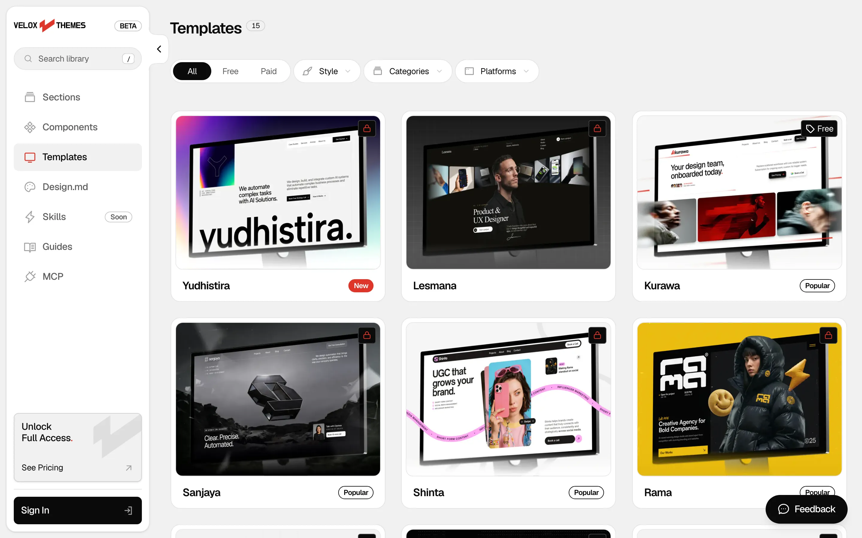
If you're starting from scratch, start from a design someone has already finished. That's what we make at Velox Themes. The Velox Themes MCP connects Claude Code, Codex and other AI tools to our library. A free account can connect it and add free sections. The Design.md guides used in this test come with a paid plan.
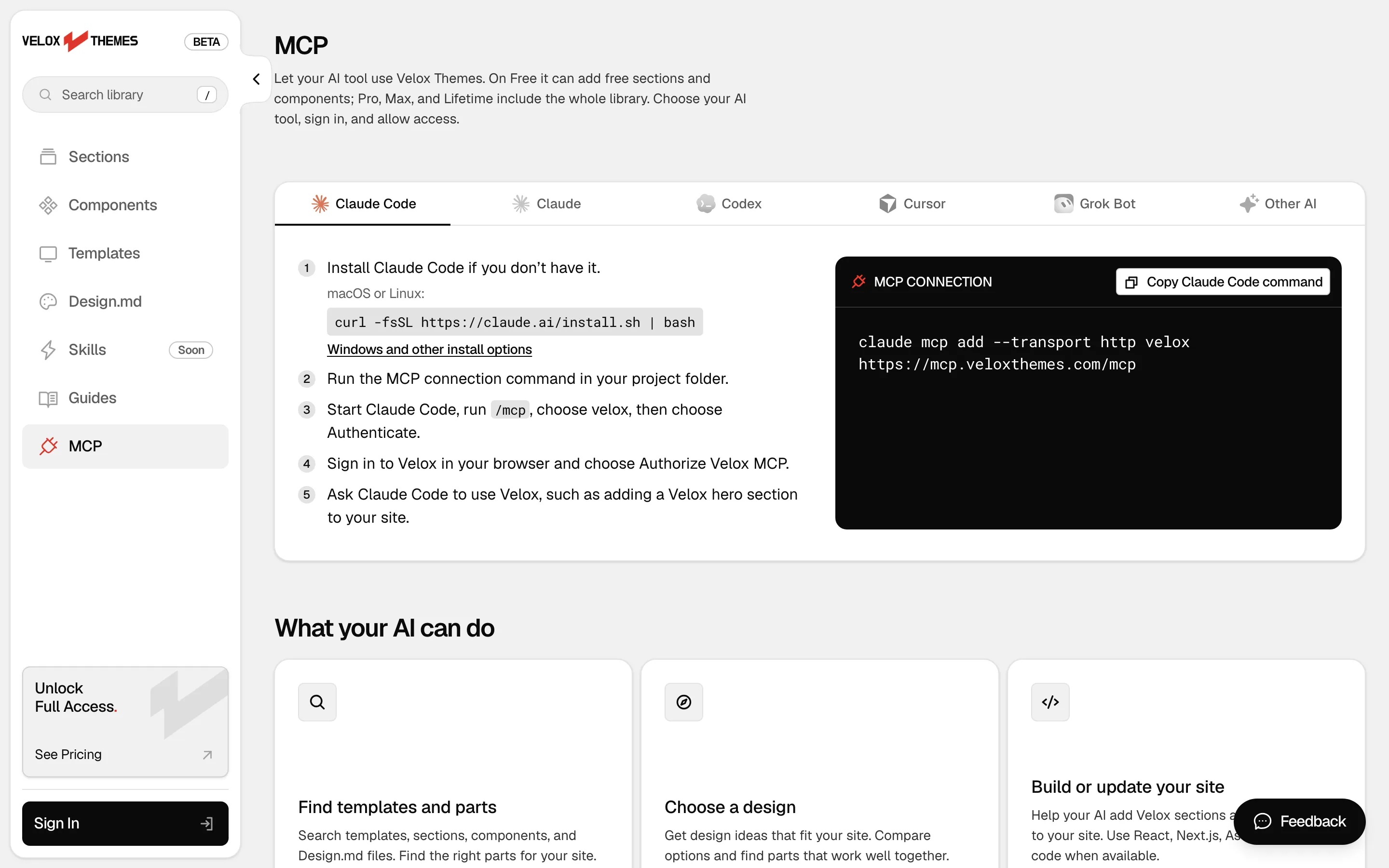
You can also start for free with templates like Kurawa (Free) and Arjuna (Free). Then tweak them with your AI tool.
If you use Claude Code, my test of 7 Claude Code skills for web design found the same thing: giving the AI a design to follow matters more than anything else.
How I set up the test
For anyone who wants to check my work or run it again:
- Tool: the Claude Code desktop app, version 2.1.317.
- Effort setting: medium for both models, which is Opus 5.5's default. I checked this in every session's log.
- Fresh start: each website was built in a new session, with no memory of the others.
- One go: one prompt per website, with no follow-ups and no edits by me. Each AI could check its own page in a browser before it finished. All did except Opus's round 1 North Form.
- When: 10 November 2026. Fable started at 07:42 WIB, Opus's round 1 at 08:02 WIB, and Opus's rounds 2 and 3 at 08:33 WIB.
- Time: working minutes from each session's log. Two Opus builds were paused once by mistake, so I only counted the time they were working.
- Cost: the text each AI read and wrote (from the logs), times Anthropic's normal prices. It also counts text the AI saved and re-read. Re-reading costs $0.20 per million tokens. Saving new text costs $10 (Fable) or $5 (Opus) per million. I ran these on a subscription, so this is what the same work would cost on Anthropic's API.
- Checks: I opened every page at desktop (1440 pixels wide) and phone (375 pixels wide) sizes.
- The full prompt: each prompt above also started with these rules. I've left out one line that pointed to a folder for notes, and the line that told the AI where to save the file.
Standalone one-off page build. The working directory holds an unrelated Astro project: do not read, reuse or edit anything from it or from other folders under `model-comparison/`, and write only inside the output folder named in the task. Commit nothing and do not switch branches. Do not ask questions; make your own decisions, build the page in one pass, and stop once `index.html` is complete.Every build, one by one:
Tally Desk
| Round | Model | Template | Minutes | Tokens written by the AI | Cost |
|---|---|---|---|---|---|
| 1 | Fable 5.2 | None | 4.6 | 29.5K | $2.04 |
| Opus 5.5 | None | 2.5 | 16.6K | $1.01 | |
| 2 | Fable 5.2 | Kresna | 6.1 | 38.2K | $3.12 |
| Opus 5.5 | Kresna | 9.2 | 56.8K | $3.19 | |
| 3 | Fable 5.2 | Kresna | 7.0 | 38.1K | $3.46 |
| Opus 5.5 | Kresna | 4.8 | 32.3K | $1.73 |
North Form
| Round | Model | Template | Minutes | Tokens written by the AI | Cost |
|---|---|---|---|---|---|
| 1 | Fable 5.2 | None | 5.5 | 33.7K | $2.45 |
| Opus 5.5 | None | 2.7 | 18.3K | $0.85 | |
| 2 | Fable 5.2 | Kurawa | 6.8 | 37.2K | $3.06 |
| Opus 5.5 | Kurawa | 7.1 | 44.3K | $2.28 | |
| 3 | Fable 5.2 | Kurawa | 11.2 | 52.3K | $5.26 |
| Opus 5.5 | Kurawa | 8.1 | 48.1K | $3.20 |
Kopi Sore
| Round | Model | Template | Minutes | Tokens written by the AI | Cost |
|---|---|---|---|---|---|
| 1 | Fable 5.2 | None | 4.4 | 28.6K | $2.04 |
| Opus 5.5 | None | 2.6 | 16.8K | $0.90 | |
| 2 | Fable 5.2 | Batavia | 5.8 | 32.3K | $2.73 |
| Opus 5.5 | Batavia | 5.0 | 31.0K | $1.60 | |
| 3 | Fable 5.2 | Mandala | 7.5 | 38.2K | $3.49 |
| Opus 5.5 | Batavia | 5.3 | 31.1K | $2.07 |
FAQ
Is Fable 5.2 better than Opus 5.5 for web design?
With a short prompt and no design help, Fable 5.2 made more detailed pages. But it took about twice as long and cost more than twice as much. When both followed the same Design.md guide, their pages looked alike, and Opus cost 20 to 43% less.
Which Claude model is best for web design?
For most website work, Opus 5.5 with a good design to follow is the best value. Use Fable 5.2 for big or tricky pages where you want more detail on the first try. Anthropic also suggests starting with Opus 5.5 for most coding.
What is the best AI for web design?
On 10 November 2026, Fable 5.2 led the Arena WebDev scoreboard on an early estimate, with Opus 5.5 close behind. Opus 5.5 led Design Arena. But in my test, the design you give the AI mattered more than which top model you pick.
How much does Fable 5.2 cost?
Fable 5.2 costs $8 per million tokens of text it reads and $40 per million tokens it writes. In my test, one website cost between $2.04 and $5.26 to build at those prices.
Is Fable 5.2 worth the extra cost for websites?
For quick drafts you'll change anyway, usually not. Opus 5.5 got close for less. For a big or tricky page where you want more detail on the first try, it can be.
Why do AI-made websites all look the same?
When you don't give an AI a design to follow, it picks the most common choices it has seen. In my test, that meant a cream background, the Fraunces font and one slanted word on 5 of 6 pages, from two different models. Giving the AI a real design to follow fixed that every time.
Do I need an MCP to get a better design?
No. Any clear design direction helps, like your client's brand, screenshots of sites you like or a written Design.md guide. An MCP like Velox Themes just lets the AI find a finished Design.md guide by itself, so you don't have to paste one in.
Sources
All read on 10 November 2026.
- Anthropic: Introducing Claude Fable 5.2 and Claude Mythos 5.2
- Anthropic: Claude Fable product page
- Anthropic: Claude Fable 5.2 and Claude Mythos 5.2 system card
- Anthropic: Introducing Claude Opus 5.5
- Claude API pricing
- Arena WebDev leaderboard
- Design Arena leaderboard
- Artificial Analysis: Claude Fable 5.2